01- Introduction
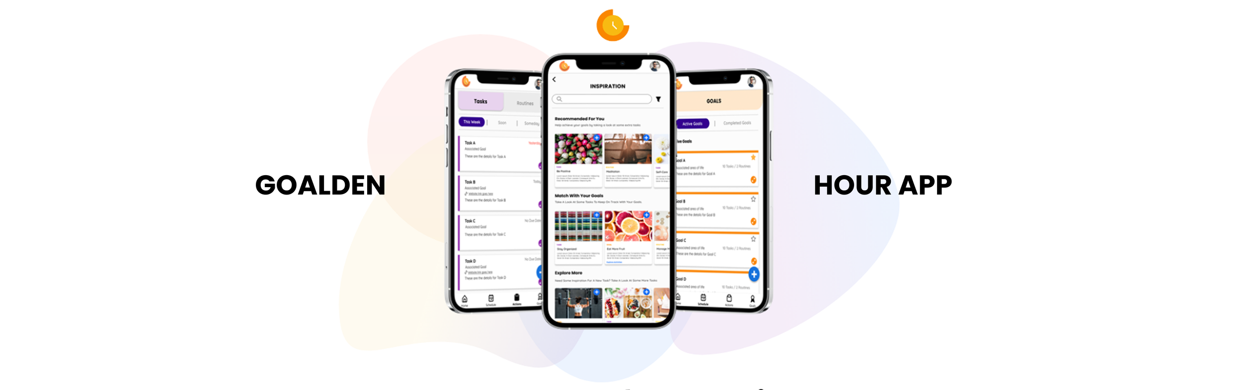
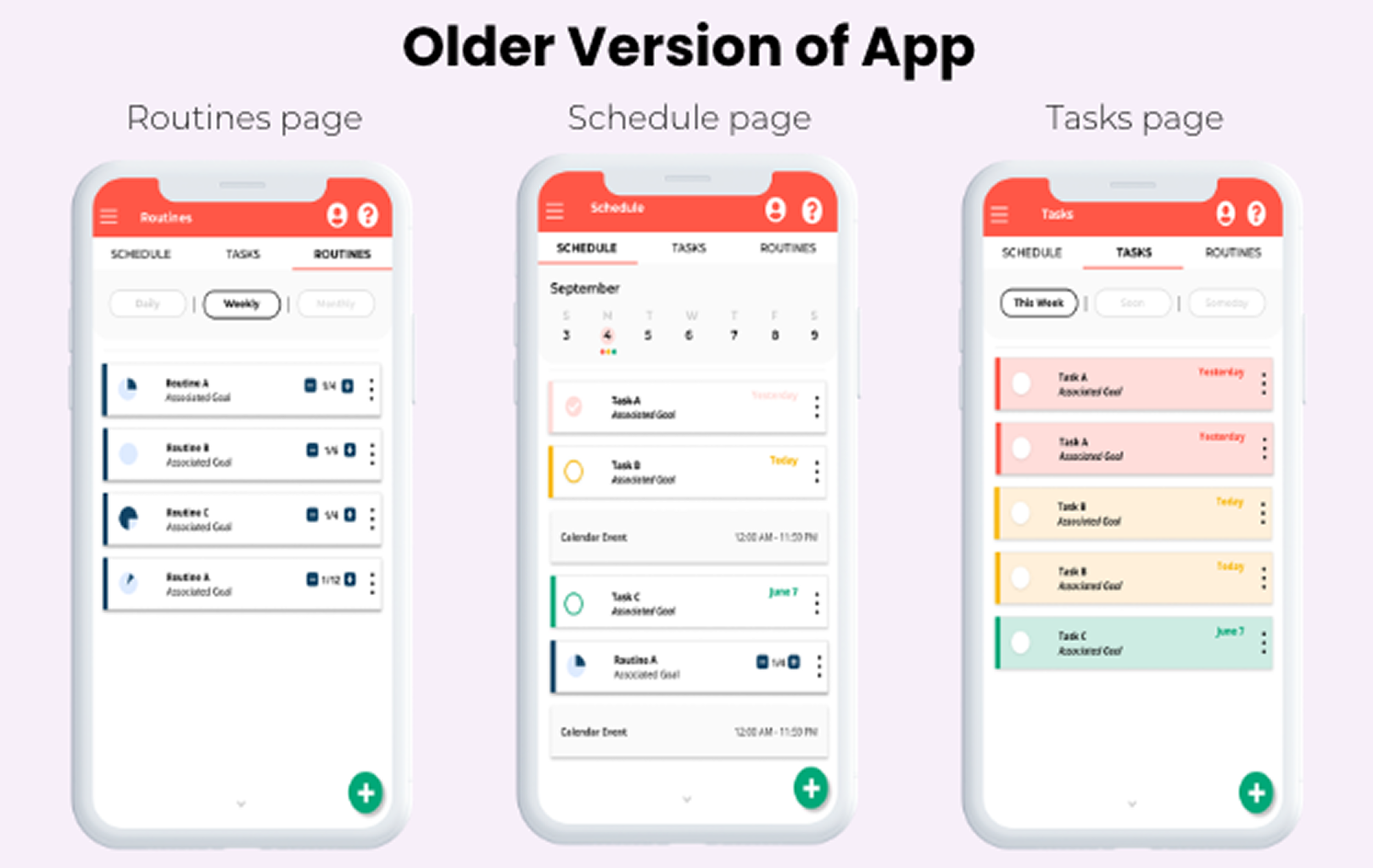
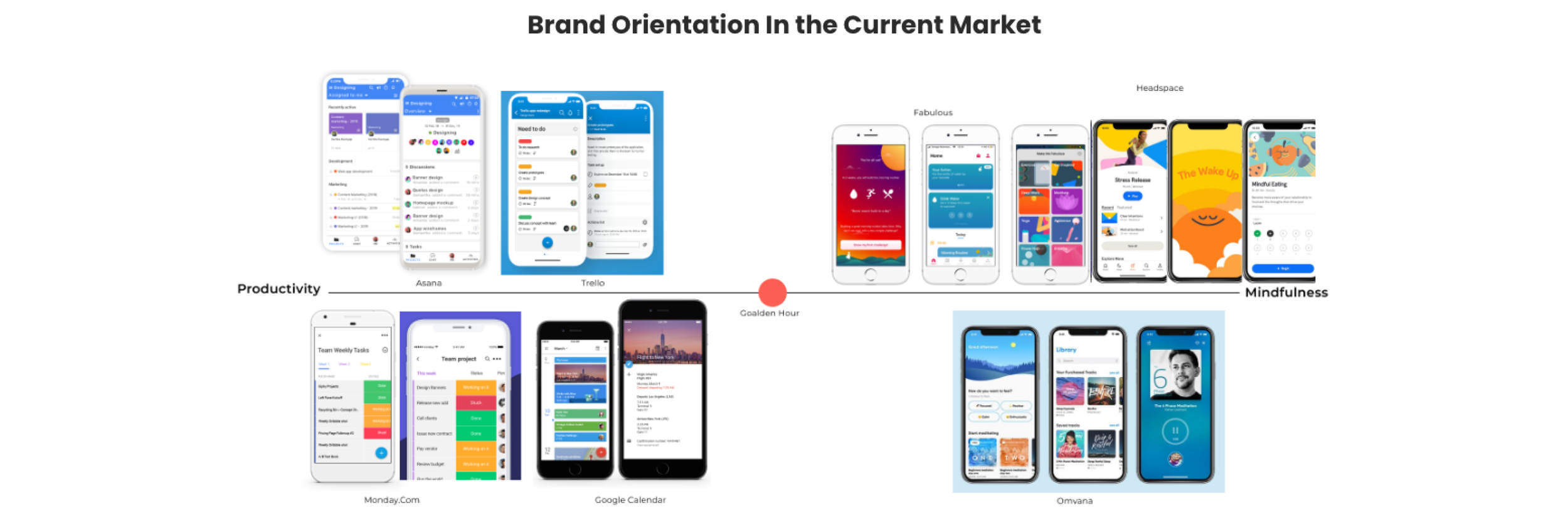
Goalden Hour is a goal-driven productivity tool that combines scheduling, task management, and self-improvement, helping people bring their goals and good habits to the forefront of their planning, all in one place. The challenge that I faced when I joined was that Goalden Hour was building a mobile app version of their web-based MVP, but the transition was straining the UX architecture, making it difficult to balance the productivity features with the app's mindfulness focus without overwhelming users.
We concluded that redesigning the MVP as a mobile-first product was the best path forward. While this meant rethinking the flow and expanding requirements, it also gave me creative freedom over the UI and helped the team define the most important elements for users.
ROLE: Lead UX/UI designer
02- Research & Discovery
Business Needs
Goalden Hour's biggest goal for the redesign was to better serve its target market — college students — after market research showed mobile apps were a better fit for this demographic. However, as a small startup, a full product redesign meant working within limited time and money. As the sole designer, my biggest constraint was collaborating with the development team to manage the effort each component would take to build, without compromising Goalden Hour's usability or visual appeal.
User Needs
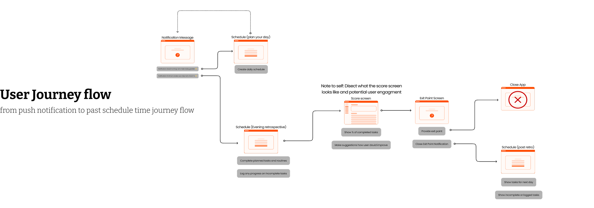
Despite being a new app, Goalden Hour still had to meet key user needs — chief among them, ease of use. Like most productivity apps, it needed to make daily task creation fast, while still reminding users of their bigger goals. This meant balancing two distinct user flows: keeping daily tasks quick and simple, without letting goal-tracking clutter the experience or slow down fast-paced users.
03- Application of design
Cards on your schedule vs. full card
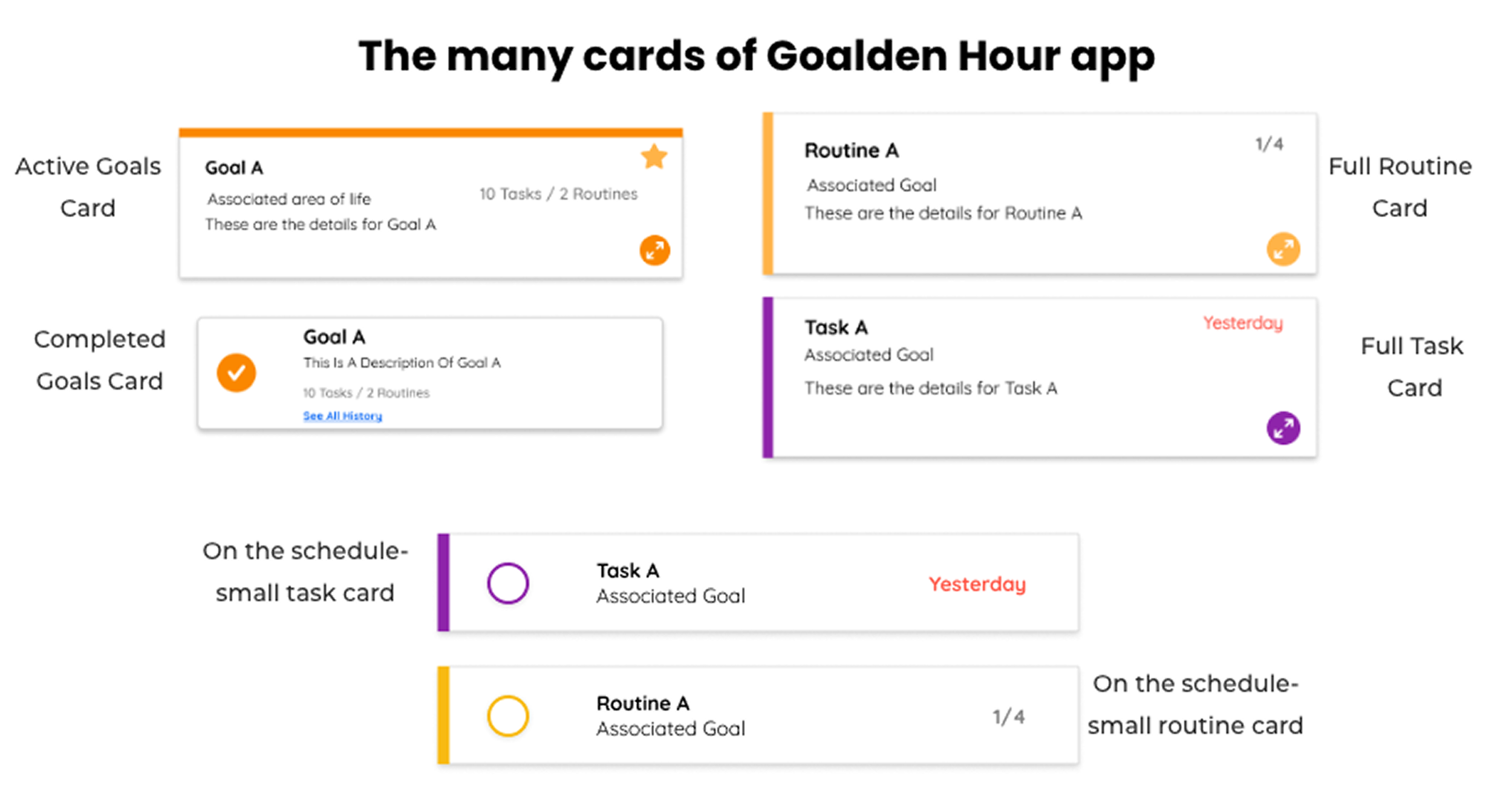
One of the first high-severity pain points we found was that the card on the schedule should be filled with the important information, but on the task and routines pages, users wanted to access more information. For us, it was important to make sure these cards look different but weren’t completely disjointed from each other. Separating these cards in design also helped to convey the idea that we wanted the user to focus on the main task/routine while on their schedule and not get bogged down with details. Yet, if they wanted to see more, they had the option of looking at a bigger card filled with the details they put in.
Adding To Your Schedule
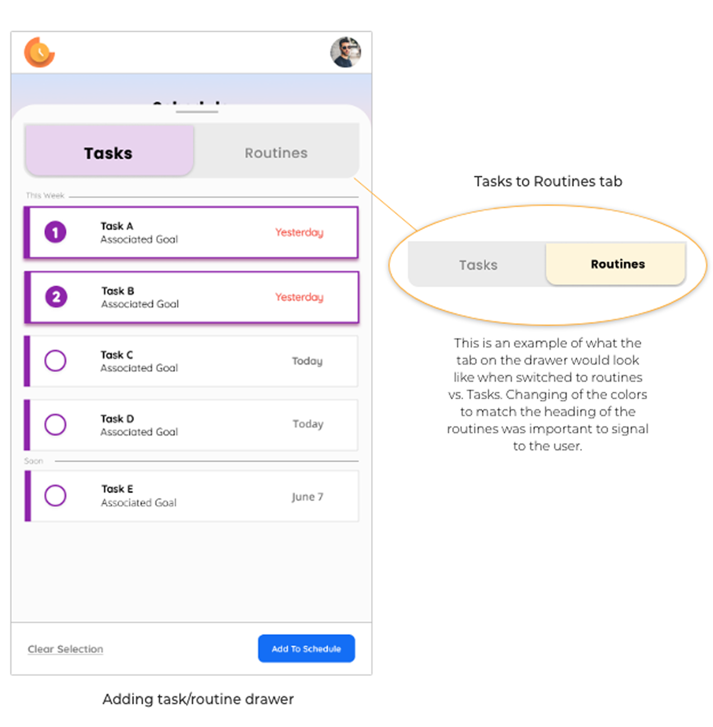
Adding a task or routine to the schedule was designed to be quick and effortless, in just three clicks. Clicking the plus button
(1) opens a drawer overlaying the schedule, where users select from their existing tasks and routines
(2) reusing the same card design from the tasks/routines screen for consistency and to ease development. Users can select multiple cards from both lists, then tap "add to schedule"
(3) to populate their schedule instantly. This keeps users on the schedule screen throughout, minimising clicks and friction.
Tasks and routines
Starred Goals
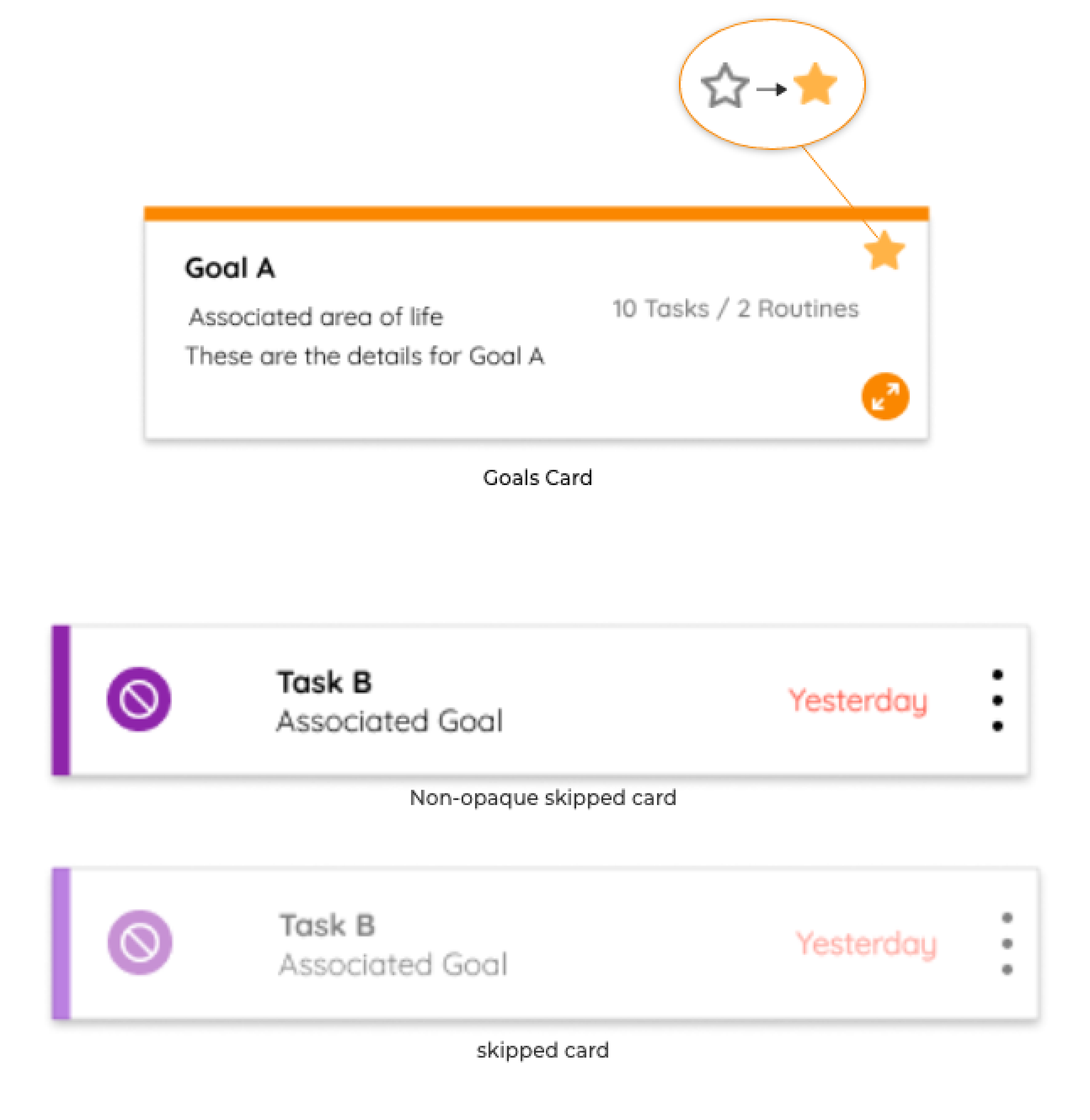
To support Goalden Hour's philosophy of reducing noise and focusing on a few goals at a time, users can "star" goals to pin them to the top of the screen. This helps prevent overwhelm and keeps users focused, without frustration, on what matters most.
Skip, Don't Delete
To reinforce daily follow-through while teaching users to moderate their workload, tasks and routines can't be deleted from the schedule, only "skipped." Skipped items turn opaque and move to the bottom of the list, letting users see what they realistically accomplished in a day and learn from it, without being punished. The item then returns to the main tasks/routines list.
Inspiration page
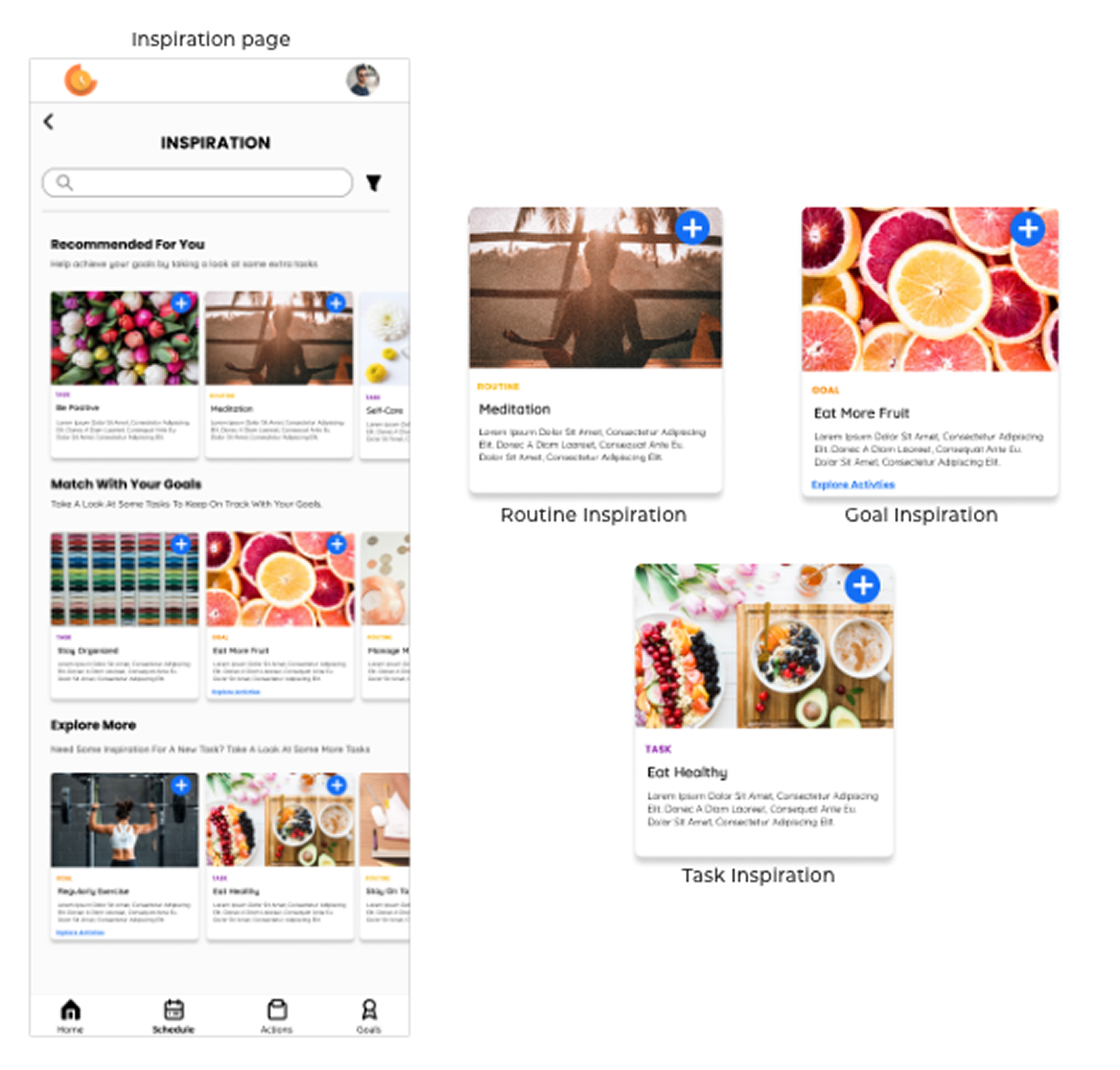
Another pain point was user confusion around what a "goal" should look like. To address this, the Inspiration page offers pre-defined goals along with matching tasks and routines, giving new users direction and helping returning users refresh stale goals. It also opens the door to future partnerships with companies that support these pre-made goals, creating a potential revenue stream for Goalden Hour.
04- Outcome
Goalden Hour was sold as a production app for college counsellors to support students in staying on track. As the sole UX/UI designer at a startup, I wore many hats: designer, user advocate, product manager, and part-time developer. It's been a rewarding journey, and I'm excited to see how the product grows to enrich more lives.