01- Brief
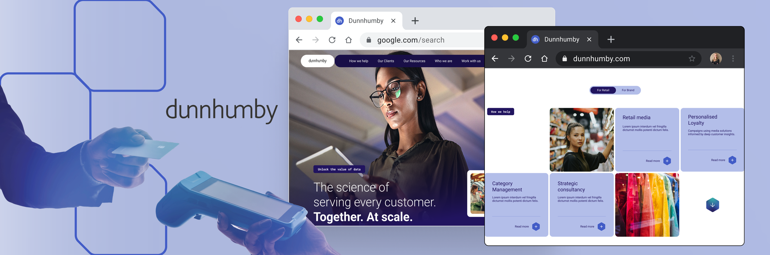
dunnhumby sought a comprehensive redesign of its corporate website to strengthen brand visibility, clearly communicate its value proposition, and increase lead generation. The new experience needed to clearly articulate how dunnhumby combines Data Science and Artificial Intelligence to generate actionable customer insights—helping businesses better understand their customers, make smarter decisions, and create more engaging shopping experiences.
The redesign focused on creating a clear, audience-centred digital experience that could communicate dunnhumby’s expertise while guiding prospective clients towards relevant content, solutions, and opportunities to engage with the business.
ROLE: Lead UX designer and Digital strategist
02- Research
Target audience
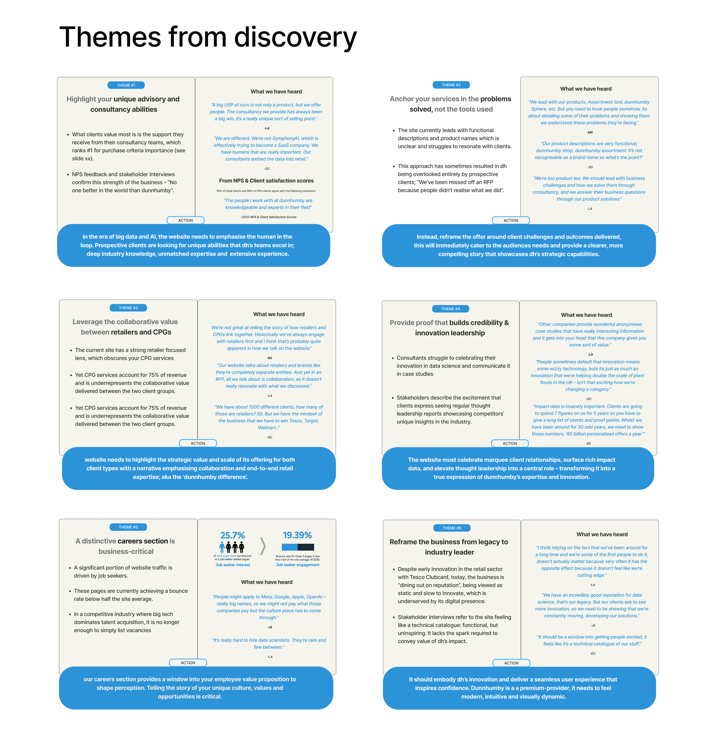
Research identified that Dunnhumby’s audiences needed a clear understanding of how its solutions could address key business challenges, including improving customer insights, enabling smarter decisions, and creating engaging shopping experiences. The research highlighted the need to communicate Dunnhumby’s Data Science and AI capabilities in a clear, accessible way without unnecessary technical language.
Audiences valued clear messaging, relevant content, intuitive navigation, and easy pathways to explore solutions and supporting evidence. These findings informed the website’s content strategy, information architecture, user journeys, and overall UX direction.
Website SEO and Analytics Audit
The research identified key opportunities across technical SEO, content strategy, mobile responsiveness, and performance measurement. The findings informed a plan to improve organic visibility for priority search terms, strengthen on-page and technical SEO, and create a scalable content ecosystem—including case studies, white papers, blogs, and reports—to support thought leadership and drive qualified traffic.
The research also highlighted the importance of a mobile-first, responsive experience and a robust measurement framework, enabling Dunnhumby to track user engagement, search performance, and conversions while continuously optimising the website.
Stakeholder Interviews
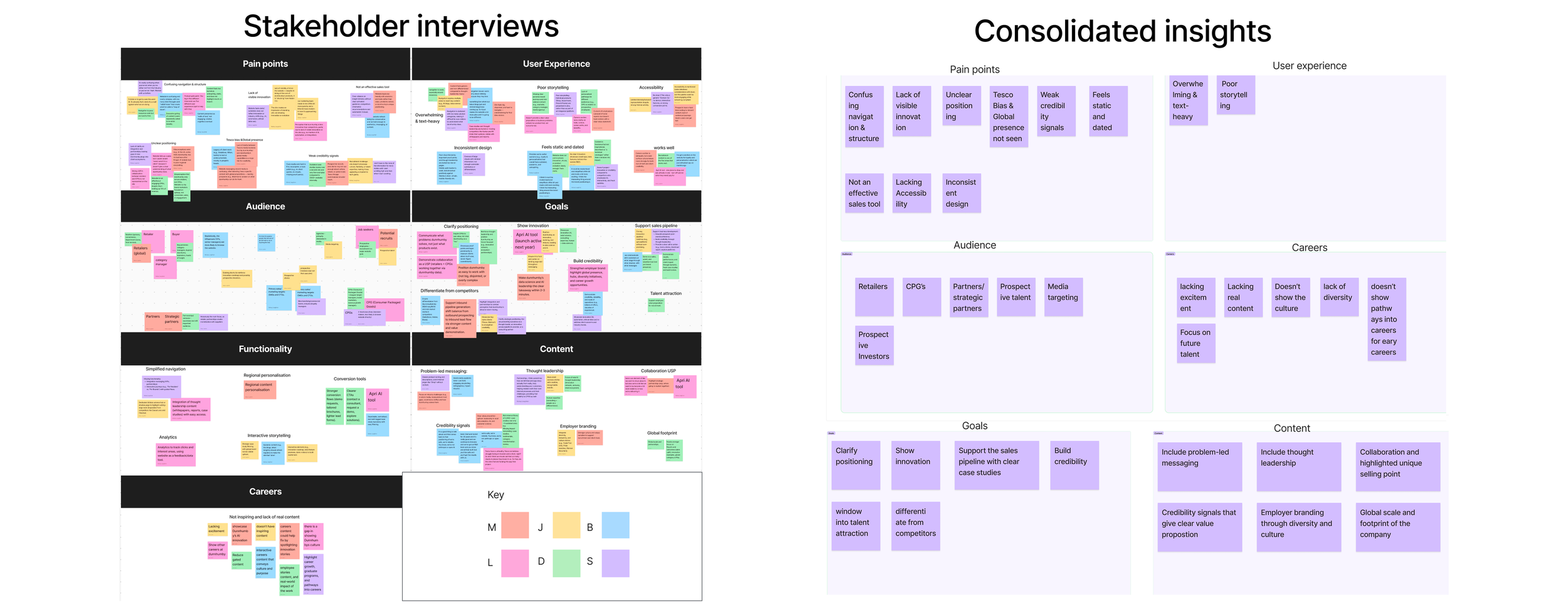
We conducted one-hour interviews with six stakeholders across different departments at dunnhumby, gathering insight into the company's services, clients, and overall goals for the website redesign. Findings were collated onto a digital whiteboard and grouped into key informational themes, which helped surface important insights that were then presented back to the client stakeholder group. To encourage full transparency, all interviews were kept anonymous.
UX-UI Competitor Analysis
A UX/UI competitor analysis was conducted to benchmark Dunnhumby against key competitors across positioning, navigation, content structure, visual design, and user experience. The research identified common patterns and gaps across the competitive landscape, highlighting opportunities for Dunnhumby to differentiate through clearer communication of its Data Science and AI capabilities, stronger audience pathways, and more engaging content experiences.
The findings informed the information architecture, visual direction, content strategy, and key interaction patterns for the new website, helping create an experience that was both competitive and distinctly aligned with Dunnhumby’s brand and business objectives.
UX Writing
With a new brand direction underway, Dunnhumby needed a clear, consistent tone of voice that communicated its expertise in an accessible and engaging way. Working with stakeholders, I translated the brand strategy into a user-centred content approach, ensuring its Data Science and AI proposition was communicated clearly without unnecessary technical language.
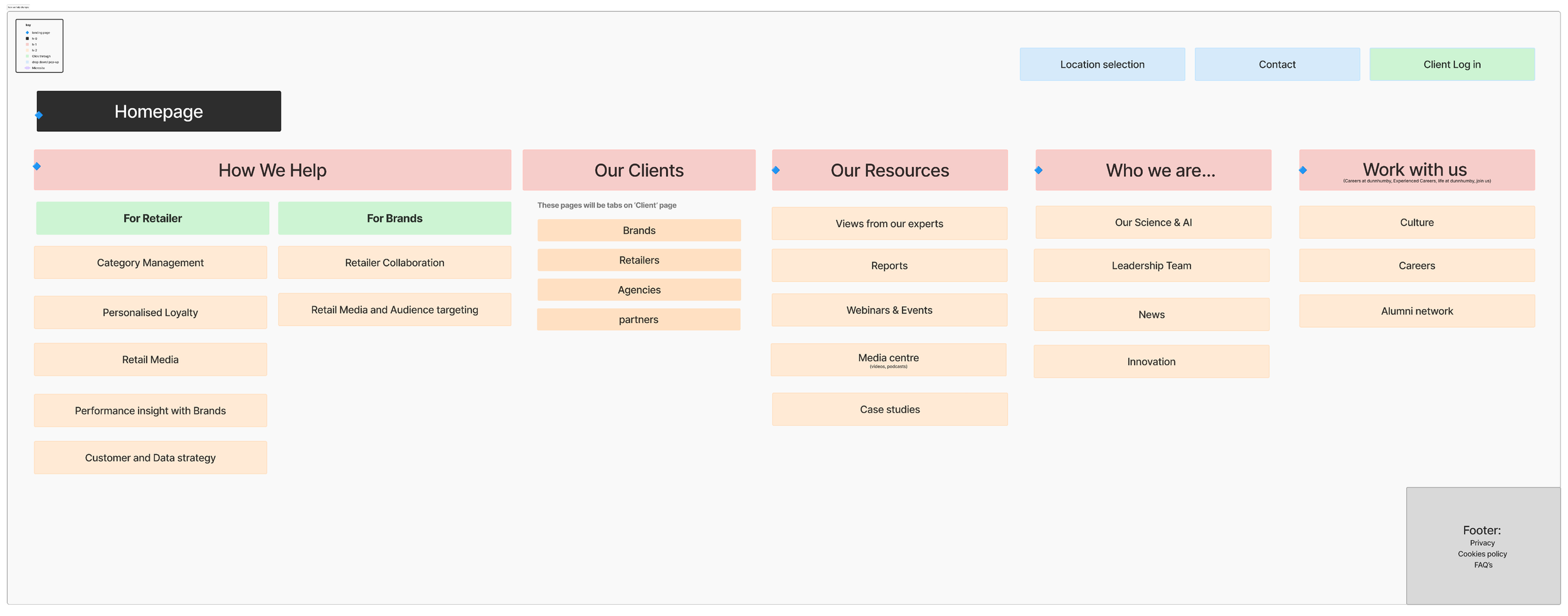
Using concise, descriptive UX writing across the information architecture, sitemap, navigation, and page titles, I created a more intuitive content structure that strengthened Dunnhumby’s value proposition and helped audiences quickly find relevant information.
03- Structure
Defining the IA & Speaking to the Right Users
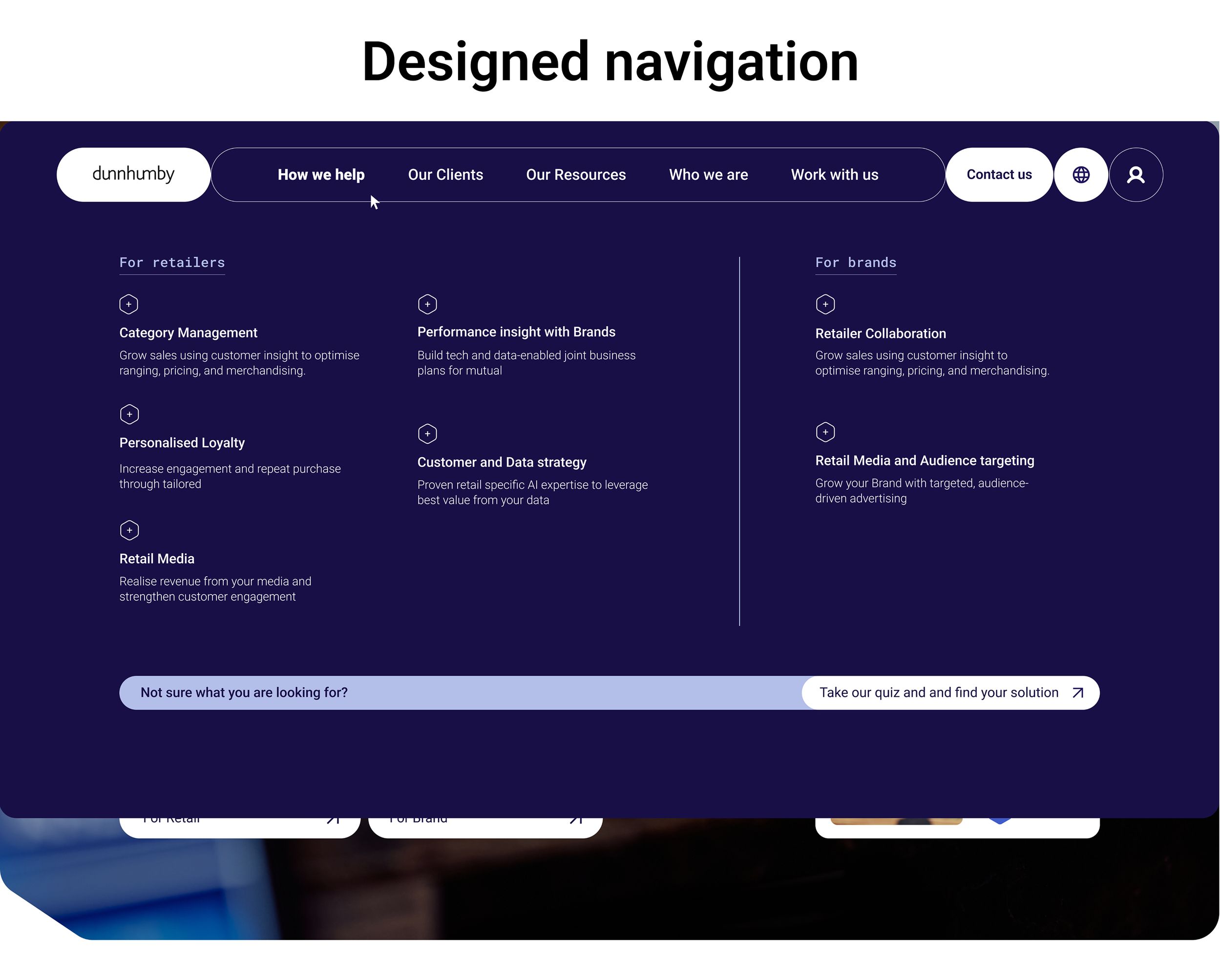
The navigation was the first place to introduce dunnhumby's new brand language. Through the UX audit conducted during discovery, we identified a clear gap: users were struggling to find the information they needed quickly and directly. This presented a key challenge for dunnhumby, who needed to avoid oversimplifying their language to the point of appearing unprofessional, while still guiding new users enough to navigate the site with confidence.
To address this, we kept page titles professional and descriptive of the services offered, while introducing a contextual paragraph beneath each one to explain the service in more accessible language.
A further gap surfaced during stakeholder interviews: brands were unaware of the full scope of services dunnhumby could offer them. To better speak to this audience, we broke out a dedicated section of the navigation, adding specific pages tailored to their needs so this user group felt properly represented.
Wireframes & Adjustments
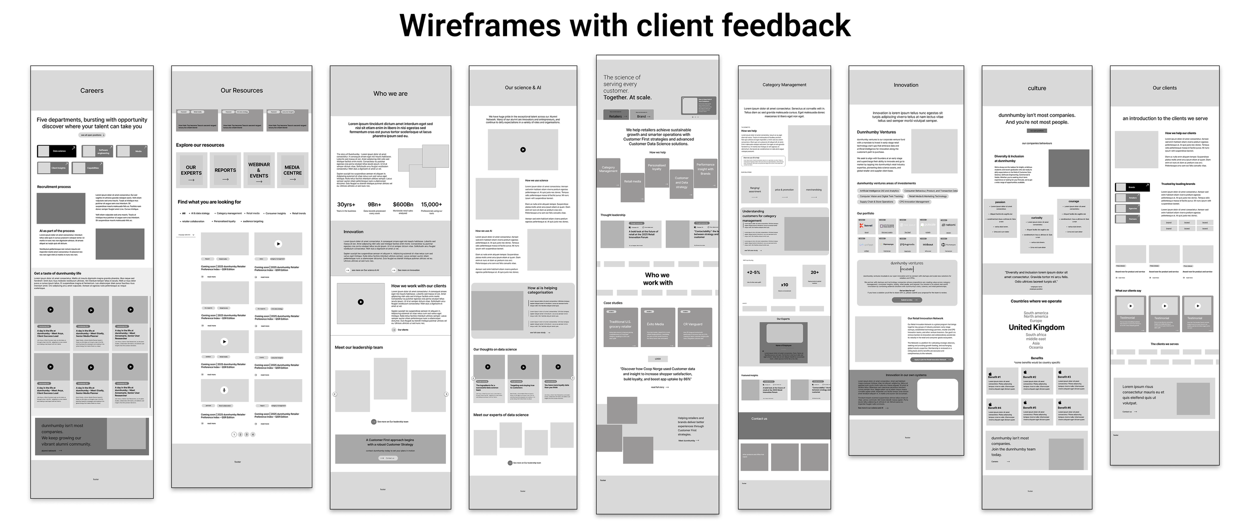
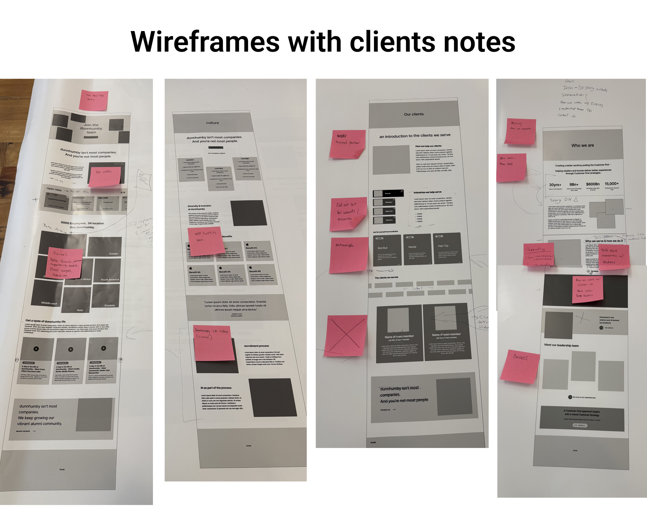
The wireframes marked the first tangible progress dunnhumby could see toward the website redesign. Stakeholders wanted to stay closely involved, but weren't as familiar with digital tools like Figma, and sending individual PDFs for review quickly became overwhelming. To keep the process moving smoothly without disrupting sprint timelines, I printed large-scale scrolls of finished wireframe sections every two weeks and presented them in person, showing key functionality prototypes on screen where needed. Stakeholders used sticky notes directly on the scrolls to leave feedback, which I would then incorporate into the wireframes before passing them on to the copywriter.
This process ensured stakeholders felt confident their feedback was heard, while allowing the Radley Yeldar team to stay on schedule.
04- Design
Modules and Movement
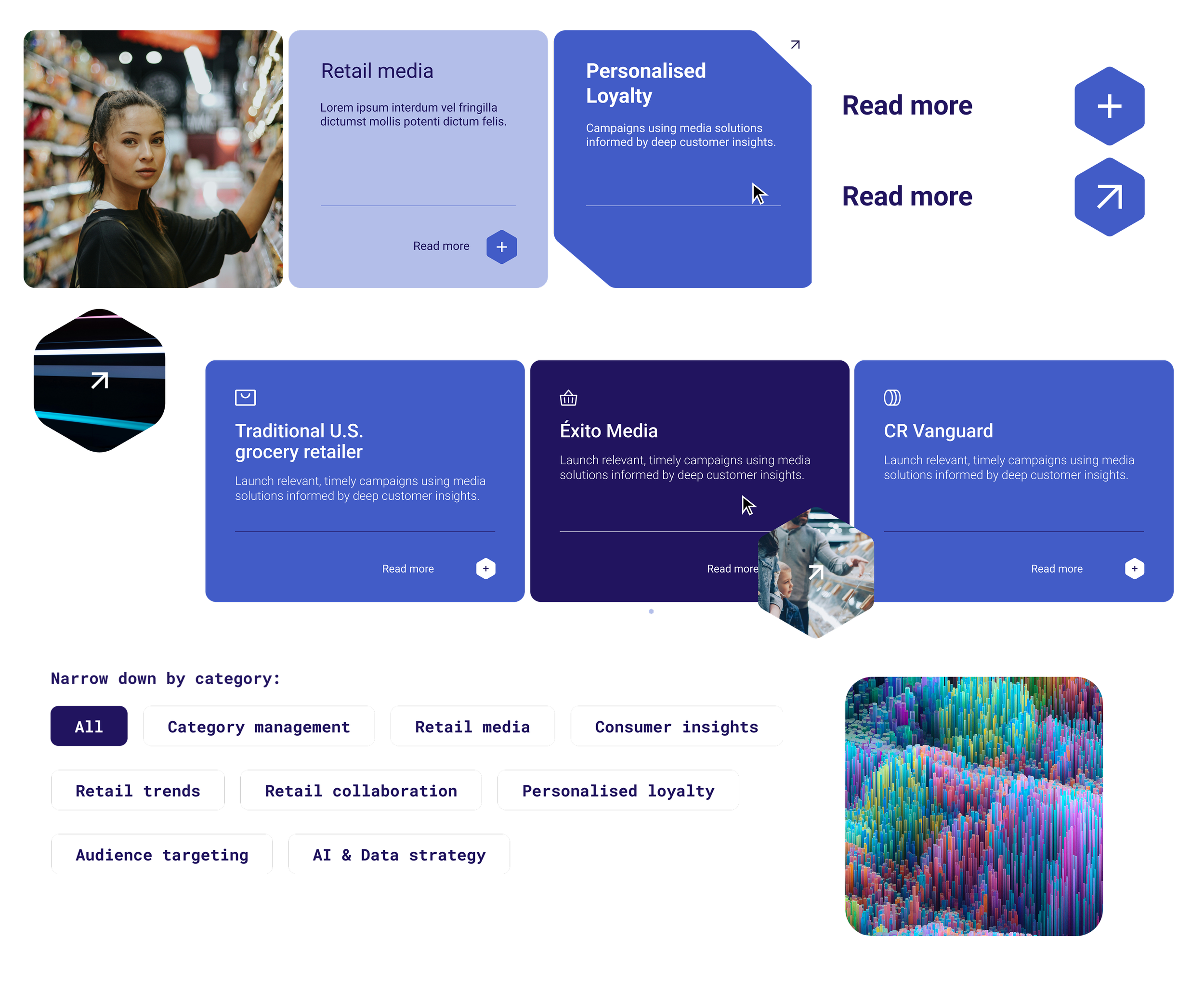
Elevating the website's design to represent dunnhumby's services and ambition better was the core goal of this project. Working closely with our UI designer, we created space for movement and allowed design assets to stand out against otherwise information-dense pages. While data and AI are dunnhumby's core services, the website needed to reflect the sensibilities of the clients searching for them. As such, the overall design was crafted to feel welcoming, incorporating photography to bring warmth to the experience, without detracting from the data-heavy subject matter at its core.
05- Metrics
Dunnhumby’s website was launched in June 2026. Metrics are still being reviewed and captured, as Dunnhumby has an ongoing contract with RY and their team.
See the full website here