
01- Problem
Since Covid, the rental office market has fundamentally shifted. Occupiers now expect more than a workspace; they want asset managers who understand their evolving needs and can offer flexible, employee-focused environments. To compete in this changed landscape, Legal & General needed a dedicated website for its property assets, distinct from the main L&G group site, to showcase its 20 unique office buildings and their individual branding.
The site needed to strike a balance: connected to the L&G brand, but with its own modern identity suited to the property proposition. Its purpose was to act as a clear, effective shop window thats clearly communicating the capabilities of L&G's workspaces to attract occupiers, generate leads, and appeal to future partners and investors.
ROLE: UX Researcher & Designer

02- Research & Discovery
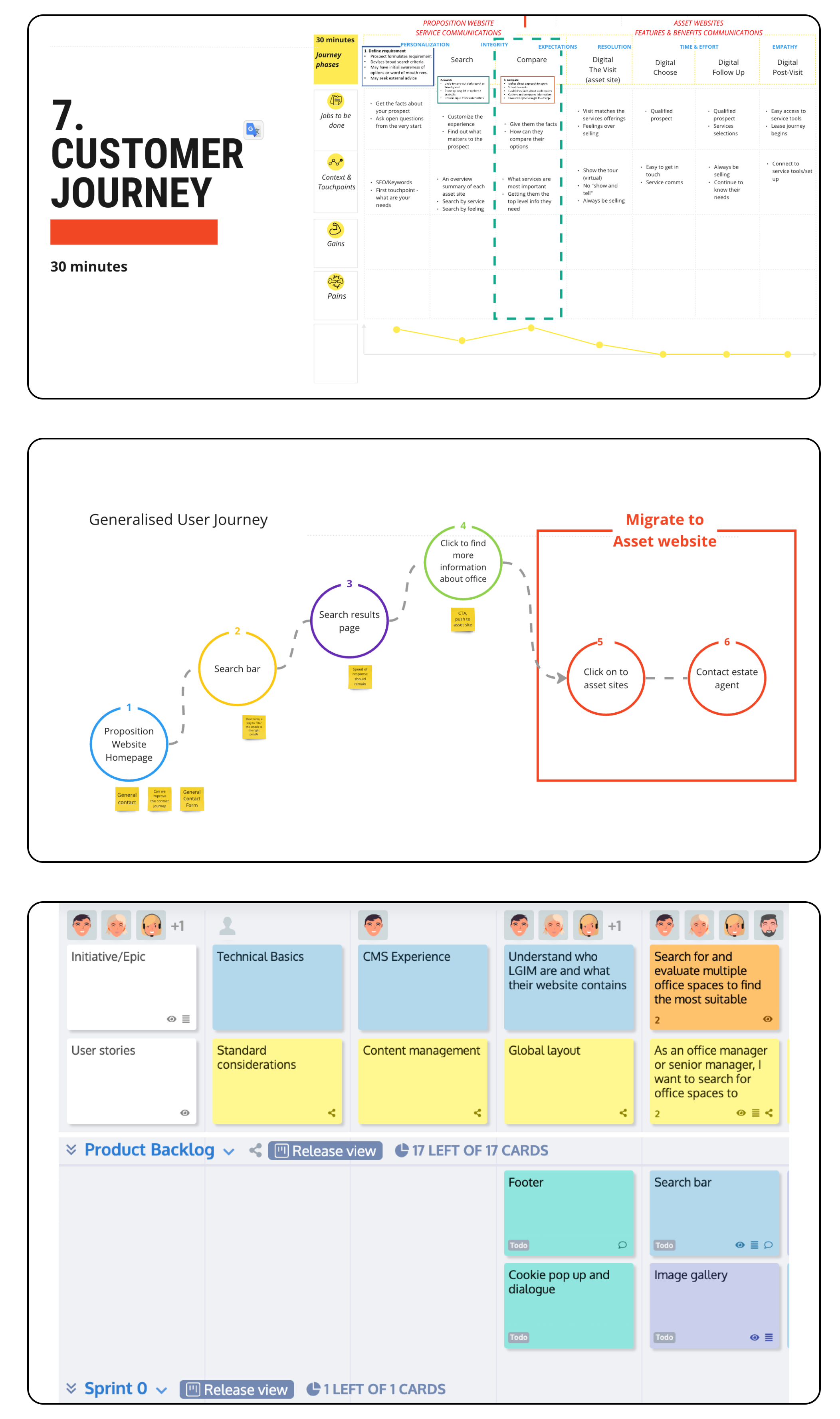
Ran individual Miro sessions with 15 property managers to define the problem statement and purpose, clarifying the needs the website would need to support.
Surveyed current occupiers of L&G workspaces to understand what guided their decision to choose L&G offices, and what they want and need from the space.
Interviewed estate agents working with L&G to identify the most common questions and concerns from potential occupiers, covering roles, responsibilities, and desired website functionality.
Presented Miro board sessions with 14 key stakeholders from LGIM to define the workspaces' unique selling points, map the ideal customer journey, explore brand alignment and naming options, and review competitor sites for design direction, informing the experience principles that would guide the UX/UI for the new identity.
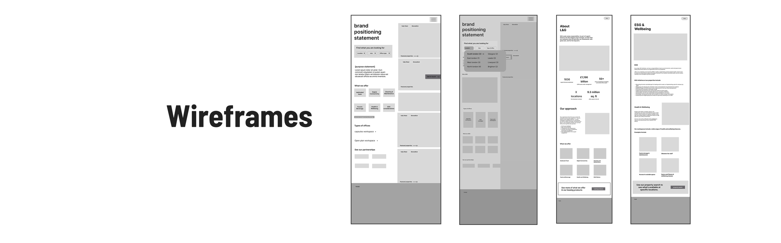
03- Application of Design
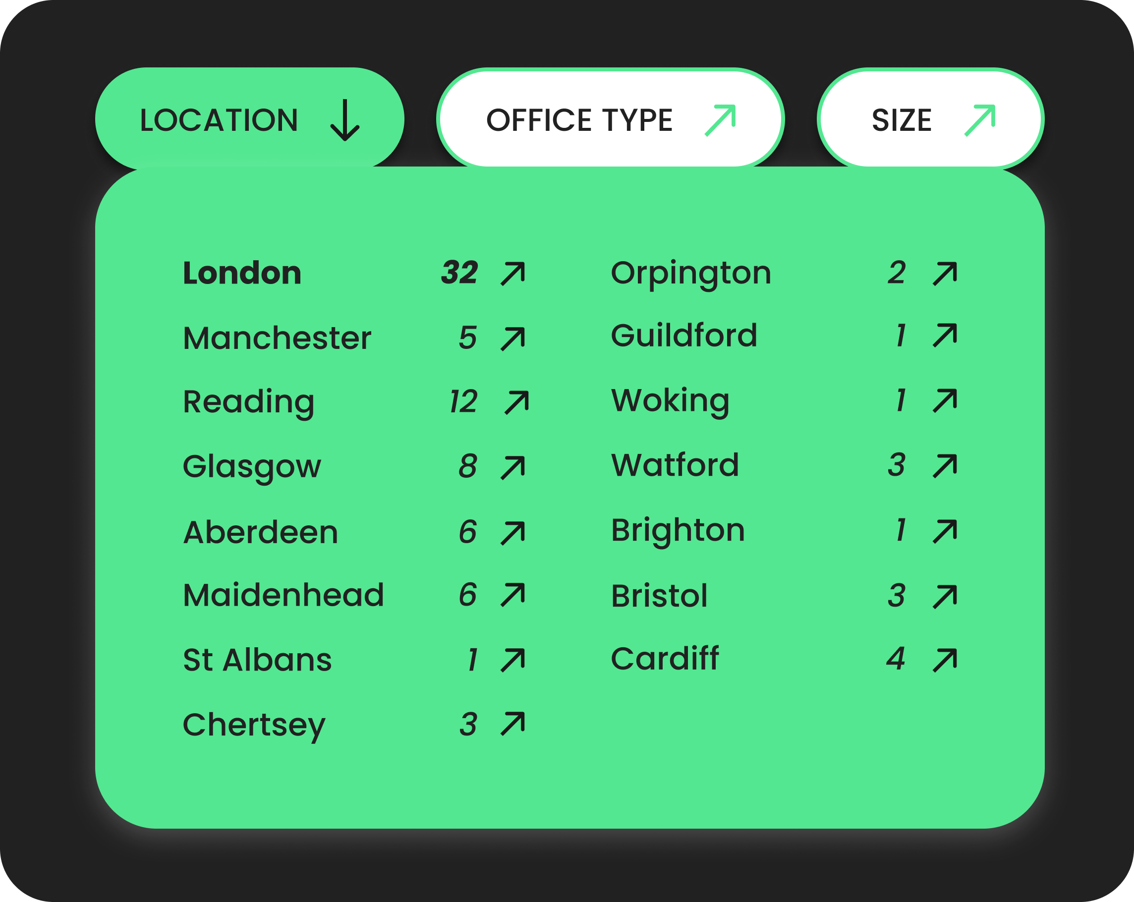
Homepage filters
Miro sessions with property managers and occupier interviews revealed a key pain point: users needed an easy way to check if L&G properties met their needs, while property managers were losing leads to inquiries that weren't a good fit. The homepage filters solve this by letting users narrow down their requirements before ever leaving the homepage. Sticky throughout the scroll, the filters let users browse freely and, once selected, take them straight to a pre-filtered properties page.
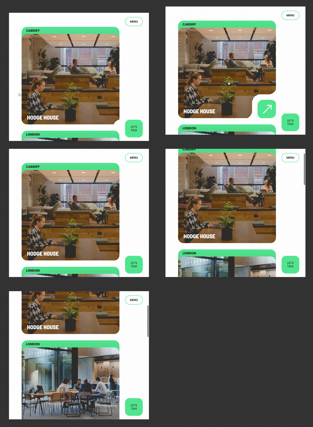
Sidebar featured properties scroll
To further address this pain point, a sidebar scroll of featured properties was added to the homepage, letting users browse available spaces without navigating to a full search page. Each listing shows the location, property name, and an eco icon flagging sustainability initiatives — supporting the goal of prioritising environmental credentials in the search experience.
UX writing
Real estate and investment are both jargon-heavy industries, and stakeholder interviews made clear that content needed dedicated UX writing to stay intuitive and user-friendly. Industry acronyms add cognitive load, forcing users to pause and decipher unfamiliar terms. Writing in clear, universal language, free of niche acronyms, reduces this friction, simplifies localisation, and helps L&G workspace content reach a broader, more diverse audience.
04- ONGOING KPIS
Legal and General workspaces launched in October 2023 and will have an ongoing managed service contract in which analytics will be monitored by an external agency.
Individual property asset sites are being built to match the look and feel of the main property website, ensuring continuity under one L&G.
If you would like to see the full website in action, take a look here