
01- Problem
Flutter has grown into a global FTSE 30 company and recently listed on the US stock market, yet its brand and investor presence have not kept pace with this achievement. As the parent company of a portfolio of brands, Flutter needed its group website to allow investors, employees, and regulators to access information quickly and efficiently, while clearly communicating who Flutter is and what they are trying to achieve to anyone new.
ROLE: Lead UX researcher & Designer
02- Discovery
Stakeholder interviews
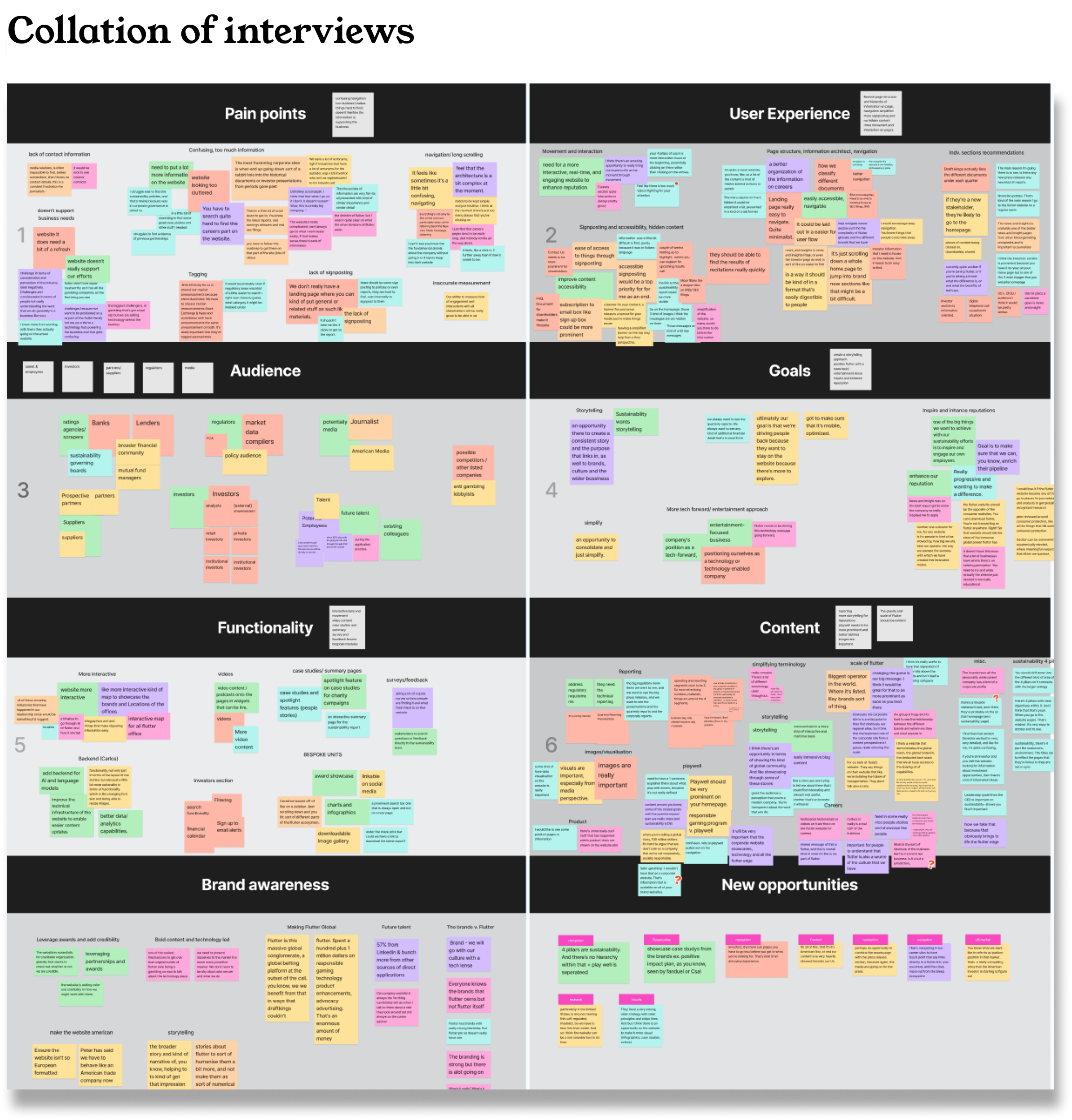
Aligning on brand positioning for Flutter's corporate website marked the start of our discovery phase. Following Flutter's transition into the US market, it was important to ensure that not only key Flutter employees had a voice in shaping the website, but that the brands under the Flutter umbrella were also represented on the main site. This process involved interviewing 42 stakeholders across various sectors of Flutter and its portfolio brands, as well as engaging with journalists, US market analysts, the chairman of charity partnerships, and representatives from the US gambling commission. All interviews were transcribed, with findings mapped onto a digital whiteboard so that consistent patterns could be grouped into clear, actionable themes.
Functionality mapping
One consistent pattern that emerged from the Flutter stakeholder interviews was that each audience had a distinct use case for the corporate website. Whether showcasing new brands within the portfolio, hosting governance and sustainability audits, or communicating Flutter's unique brand proposition to a new market, each use case introduced its own set of functionality requirements for the new site. To ensure all functionality requirements were accounted for, the development team scoped each feature on a Jira board, capturing estimated development time, cost, priority rating, proposed placement on the website, and the "T-shirt size" it would contribute to. This board was then shared with key stakeholders to align on priorities.
Discovery workshop presentation
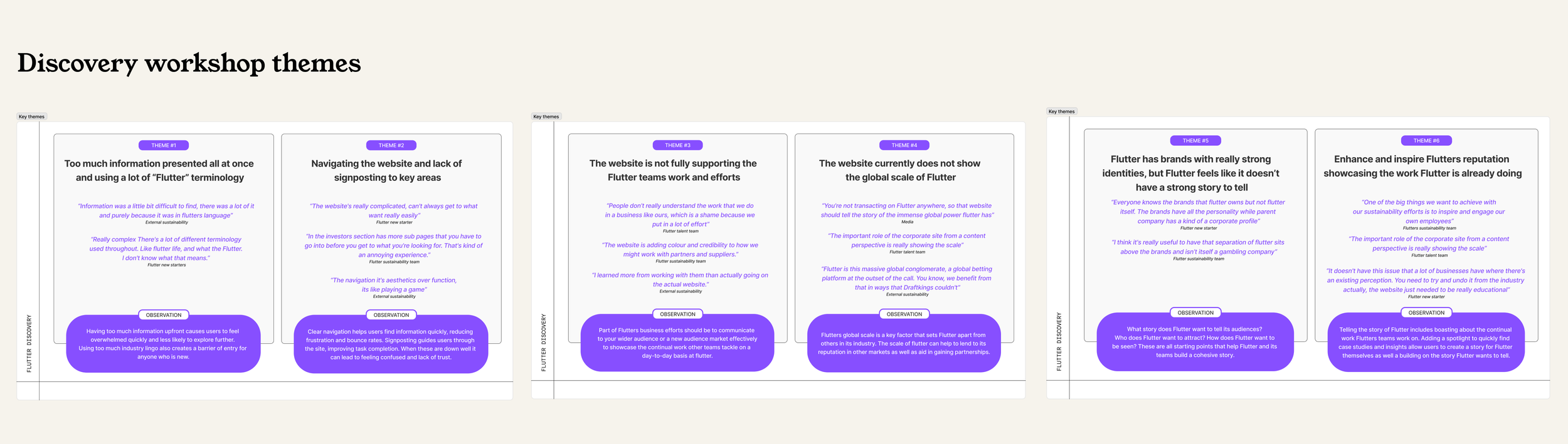
With 42 stakeholder interviews collated, key themes distilled into digestible insights, functionality mapped and prioritised, and brand positioning benchmarked against other US parent companies, we had amassed a rich and complex body of research to present back to the Flutter stakeholder team. To translate these findings into aligned priorities, we ran a 4-hour in-person discovery workshop with RY and the Flutter team in London, designed to bring stakeholders together around a shared vision for the website.
From the workshop outputs the team aligned on a strategy and agreed to the prioritised sprint output to ensure that the top functionality would have time to be developed and tested before the launch.
Sitemap
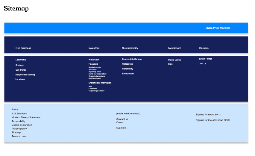
A key point of alignment reached by all stakeholders in the workshop was that Flutter's sitemap should remain simple to navigate and even simpler to understand. With such a diverse range of audiences accessing Flutter's website for information across various countries, it was essential to ensure that all users could quickly scan the navigation and find what they needed efficiently.
This meant structuring the sitemap so that the top level of navigation remained straightforward, while the second level housed more informative, content-heavy pages. The Flutter team drew inspiration from other corporate websites, such as Uber and Johnson & Johnson, admiring their communication style towards audiences, and wanted the new navigation to emulate those examples.
03- Design Considerations
Wireframes
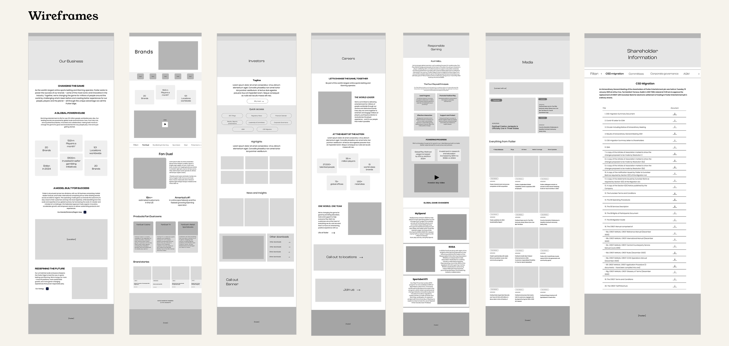
Working within a two-week sprint cycle, I broke each section of the sitemap down into individual pages to begin wireframing. Once complete, the wireframes were moved into a client-dedicated Figma file, complete with word counts and module functionality prototypes, allowing the client team to provide feedback and Flutter's copywriter to review the designs and add copy in the designated areas. Once feedback had been collected and the designs updated, the wireframes were moved to a dedicated page for finalised designs. This ensured a clear distinction between completed wireframes and those still in progress for the Flutter team.
Module design
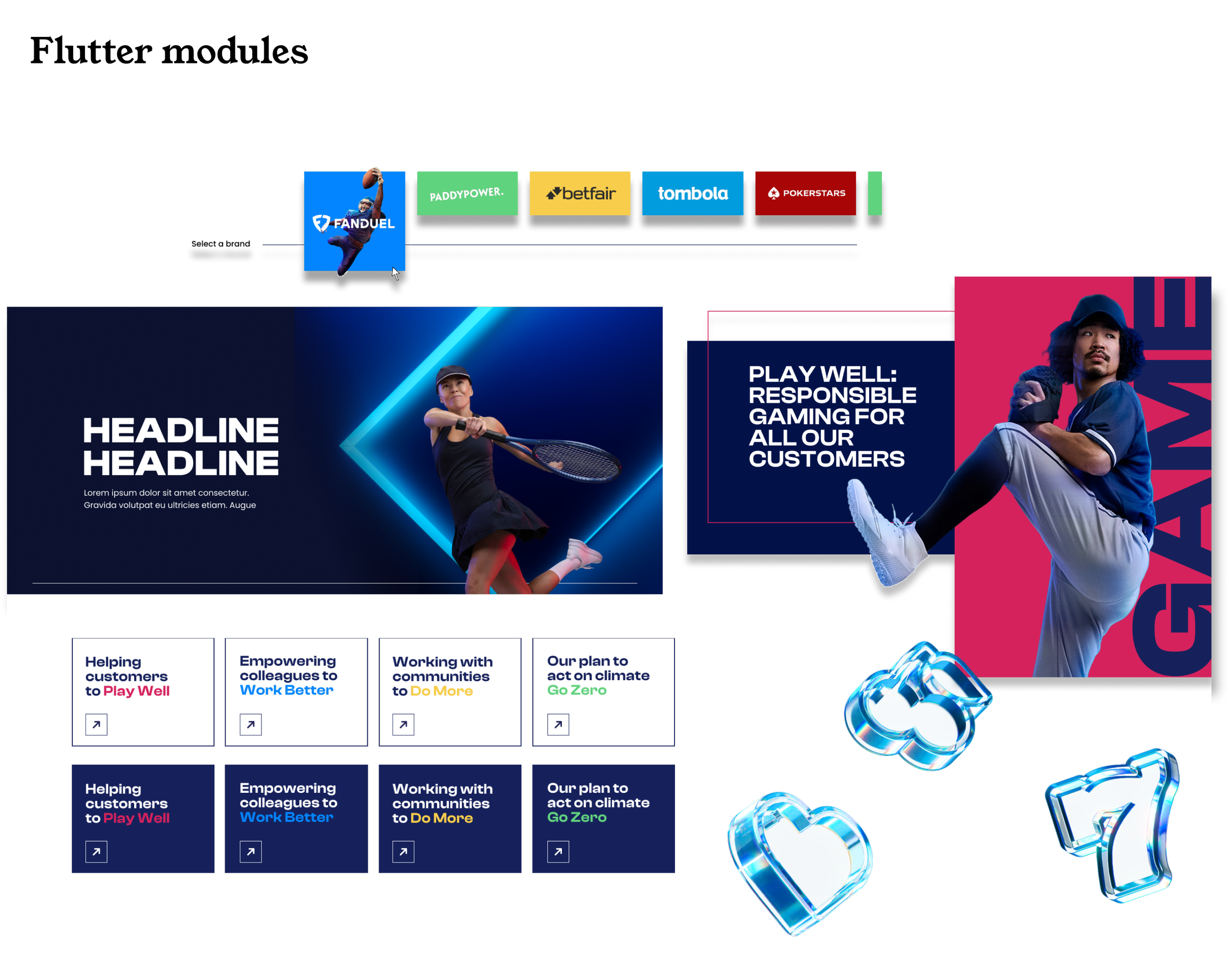
Once all wireframes were approved, I worked with the UI team to break them down into a modular design system, ready for brand colours and imagery to be applied. Using Jira, we exported the individual modules and documented functionality notes for the development team to begin the build.
04- Metrics
Flutter website launched in December 2025 with an ongoing MSA contract with the Radley Yeldar team.
Some metrics found since launch are:
+20.2% more total users on the website
+30.8% more engaged sessions from previous months
68.38% engagement rate, 24% more than previous months
81.1% more downloads on the website
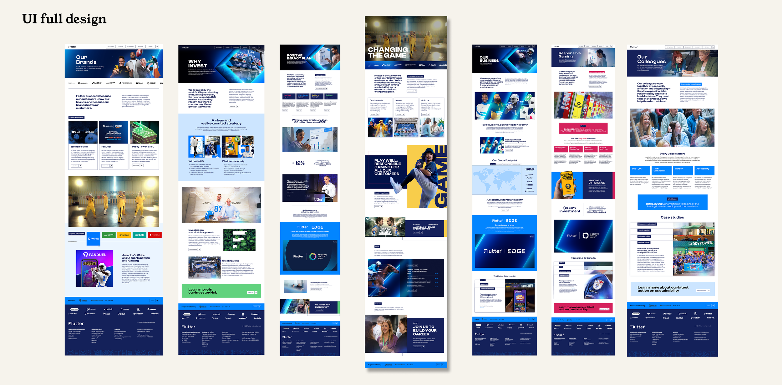
To see the full website in action, take a look at the Flutter website
*Pages of the website may look differently than outlines. Radley Yeldar’s team is constantly improving the Flutter Global website through ongoing contact with the Flutter team.