01- Problem
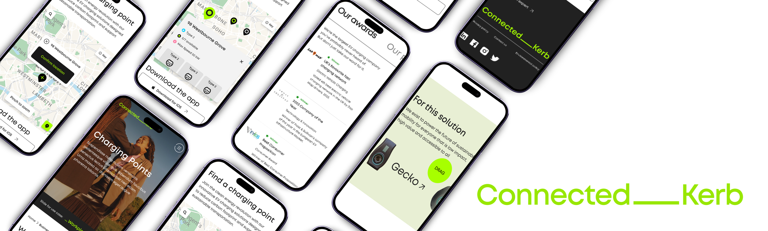
Connected Kerb (CK) is one of the UK's leading providers of electric vehicle charging infrastructure and was entering a period of high growth, having secured £110 million in investment. The company was preparing to roll out a lot more on-street charging across the UK, Europe and the US. This growth needed a website that could keep up with the new users’ needs as well as ensure investors were informed about the progress. The website needed to be delivered within three months and ensure that it had a ‘Find a charger’ map advanced enough, as the app would not be ready by the time of launch. This intuitive experience needed to be delivered as seamlessly as users expect from leading players in the EV space.
ROLE: UX research & designer
02- Research & Discovery
Business Needs
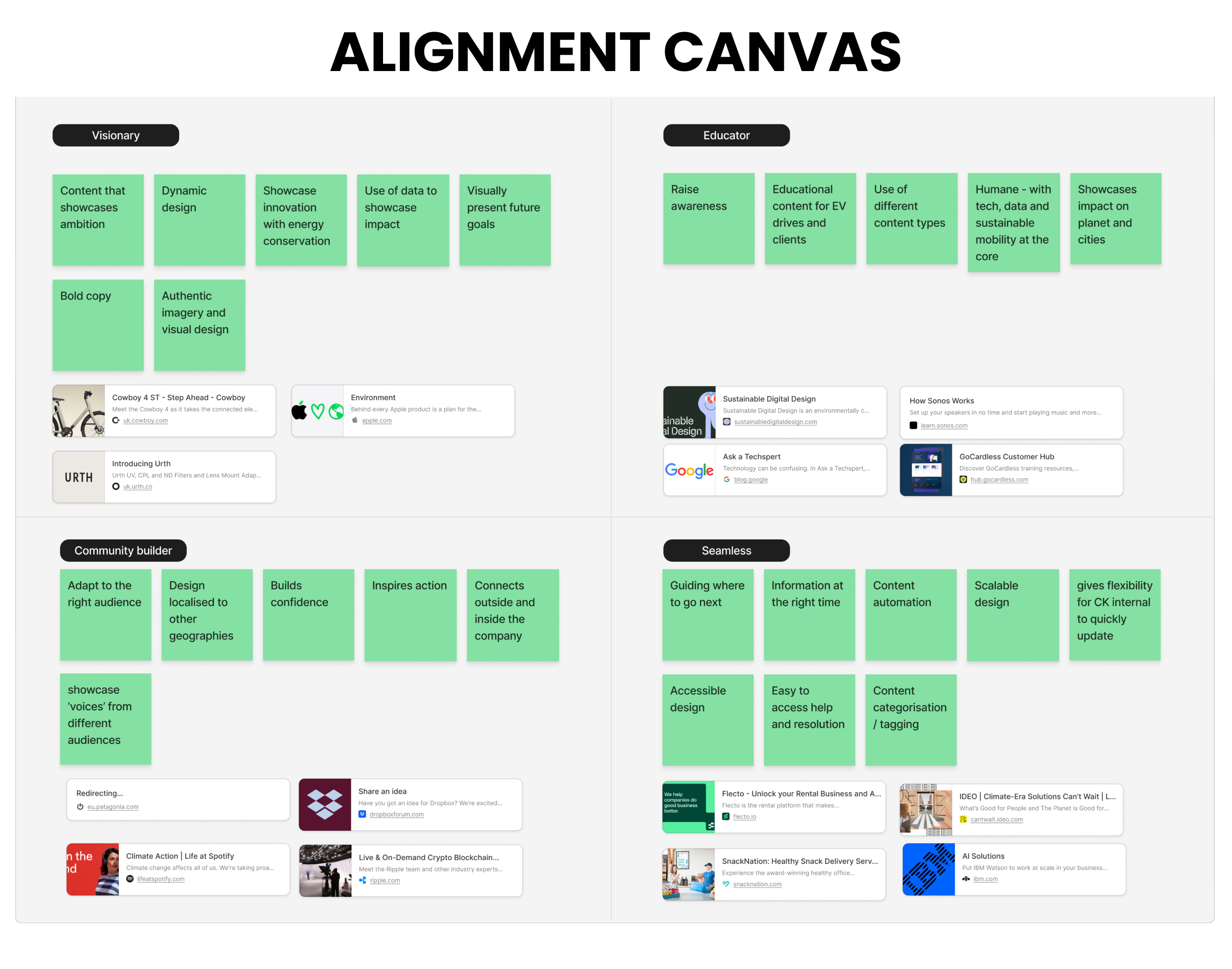
Connected Kerb is a rapidly growing EV charging provider balancing complex business needs against a wide range of user needs. To design effectively across these audiences, I first needed a deep understanding of the business itself. I conducted seven stakeholder interviews across different sectors of the organisation and aligned on business objectives through competitor analysis. This discovery phase informed a set of experience principles to guide how Connected Kerb interacts with its different audiences, while also mapping how those principles would need to translate into distinct areas of the website.
Tree-testing
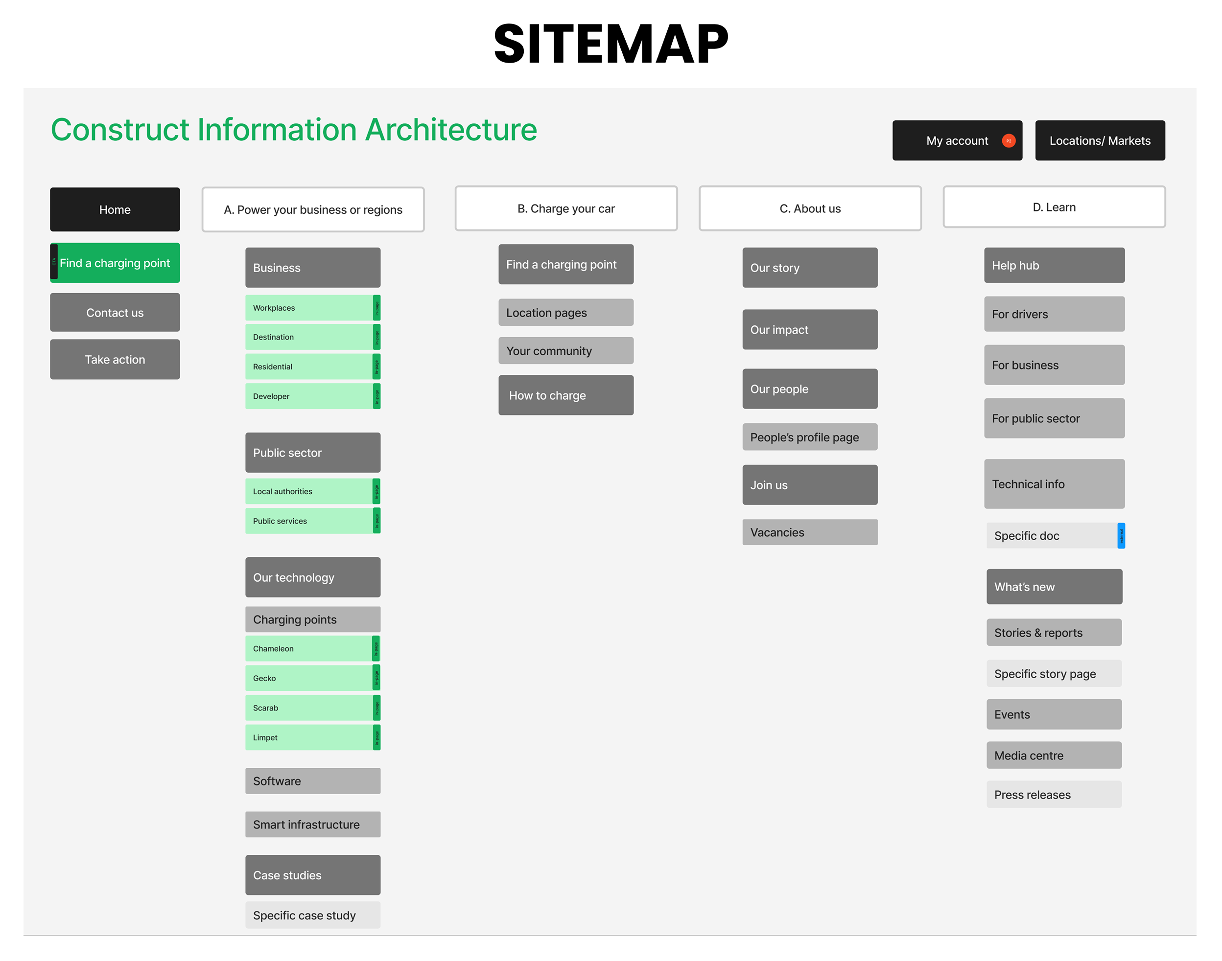
Following the tree testing of the information architecture in Optimal Workshop, several key opportunities for improvement were identified. These findings led to the following changes:
Introduce action-based top-level navigation: Develop a contextual top navigation structure that adapts based on the user’s current page and intended actions.
Create a Help Hub: Introduce a dedicated Help Hub to better support the needs of different audience groups by providing a clear and accessible destination for queries and common questions.
Develop content hubs with filtering: Introduce dedicated content hubs for areas such as Case Studies and Stories, supported by filtering functionality to help users quickly find relevant content while creating a scalable foundation for future content automation.
User Needs
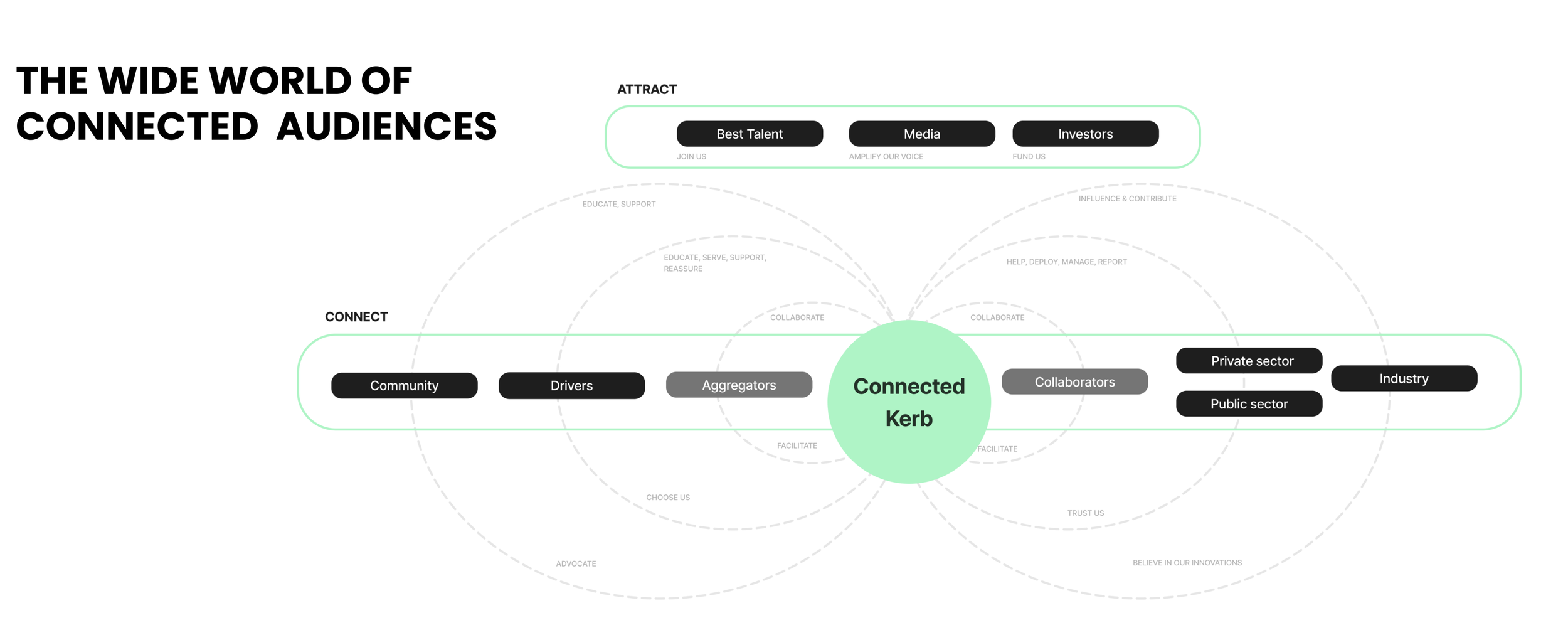
Using the business needs, I identified the audience ecosystem by connecting each business objective to the needs of the relevant audience groups. Each user group was then taken through a Know–Feel–Do exercise, with the findings mapped to identify overlapping and distinct needs across audiences. Synthesising these insights, I developed a user framework that helped define the key areas of the information architecture, as well as a functional module list to be applied during website development. The information architecture was subsequently tree-tested with stakeholders to ensure that each area was clearly defined, logically structured, and understandable to users.
03- Application of design
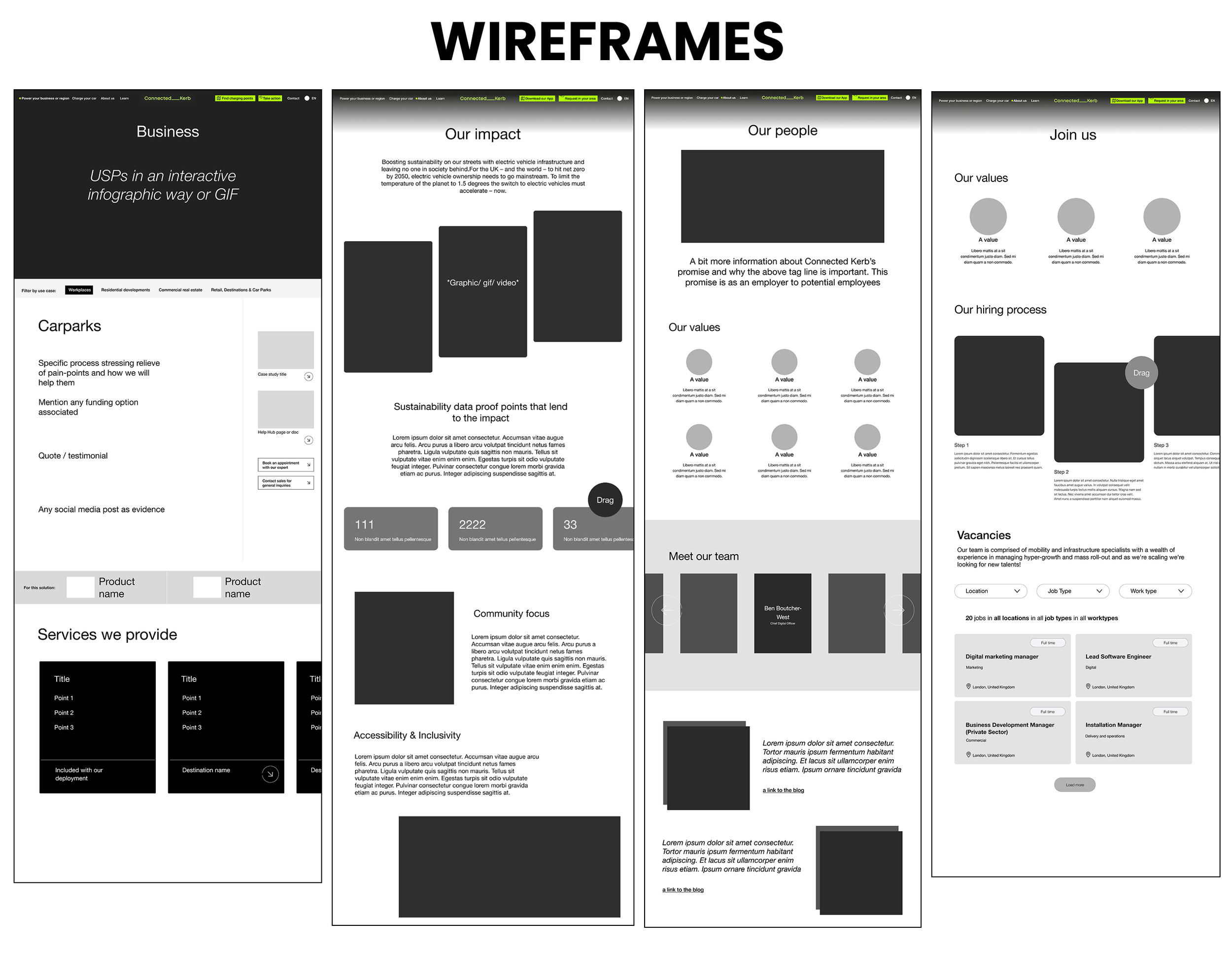
Wireframing
Connected Kerb needed a clear structure and pathway to implement their new brand identity. By leveraging the wireframes effectively, we can ensure that the rebranded website delivers an engaging user experience that aligns with the brand identity and strategic objectives. I worked closely with the Connected Kerb stakeholders to develop content areas, restructure the hierarchy and ensure that the visual communication provided a common reference point for discussing functionality while gathering feedback before passing it on to the UI designer to apply the new brand guidelines.
Connected the design to the audience
Connecting the design to the audience was a core strategic principle identified during the discovery process. A key driver of the redesign was to ensure that the website spoke to an interconnected audience ecosystem. If users do not immediately recognise that the website is relevant to their needs, they risk disengaging or leaving the site.
Working closely with the UI designer, we introduced multiple audience pathways within the hero section. An engaging animation allowed users to quickly identify and navigate to the most relevant areas of the website, while simultaneously introducing Connected Kerb’s new brand identity. This approach balanced audience needs with brand expression, creating an immediate and engaging entry point to the experience.
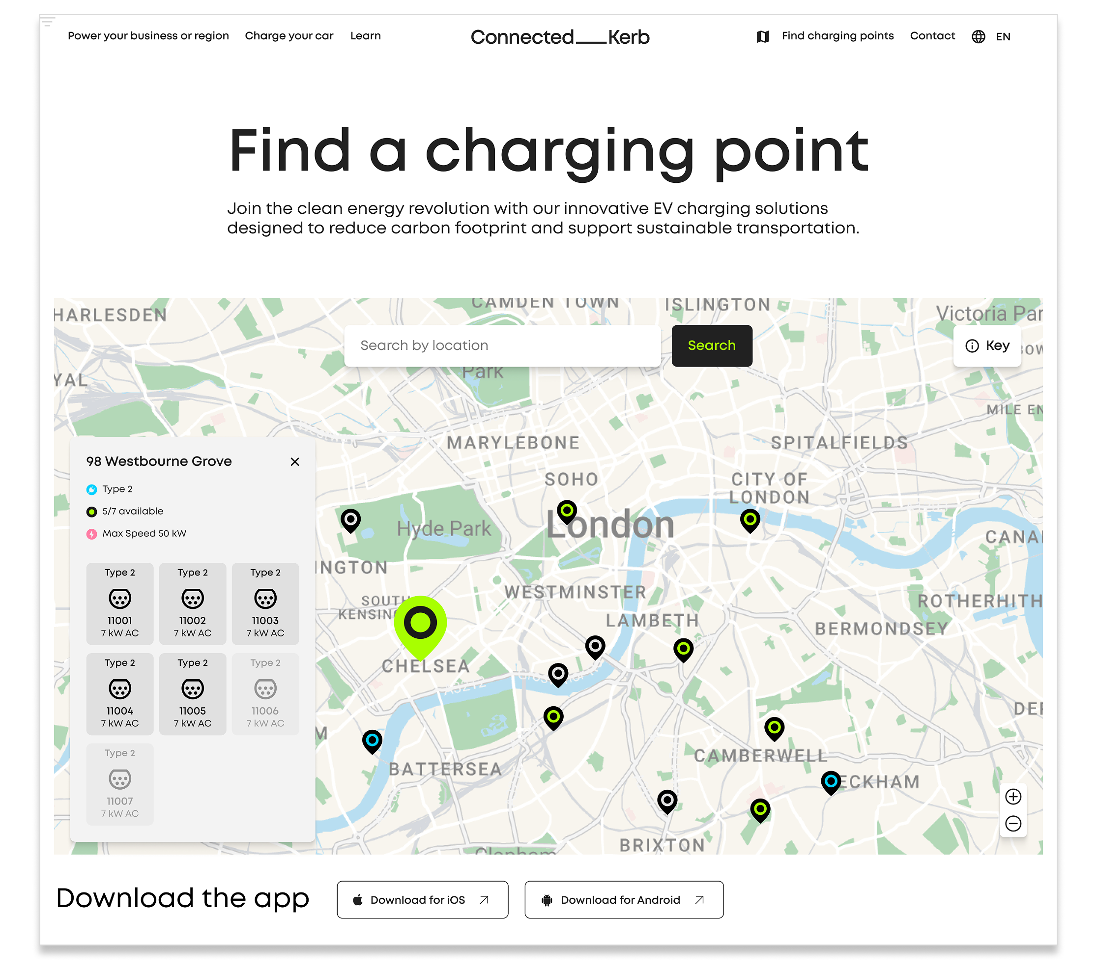
Charging point finder mapping
Finding a charging point was one of the core user experience objectives for the website. The challenge was to create a seamless map experience that remained clean, intuitive, and informative without overwhelming users.
Users needed to be able to quickly search for a specific area, identify available charging points through clear colour-coded map markers, and select individual locations to view key information, including charger types and the exact address. This enabled users to assess their options and easily navigate to their chosen charging point.
In a later iteration, we introduced the ability to connect to users’ preferred navigation apps, allowing them to seamlessly route to their selected charging point.
This approach ensured that users could complete the full charging journey, from discovering an available charger to navigating to it—even if they did not have access to the Connected Kerb app.
04- Outcome
The website launched in August 2023 and has an ongoing contract with Radley Yeldar for improvements.
Take a look at the website here