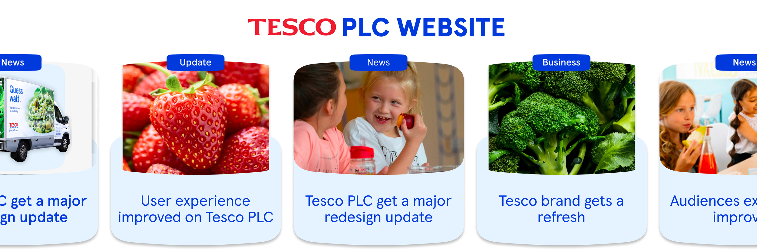
As the world's largest retail corporation, Tesco knows it can make a big difference.
With over 600k views a week, Tesco needed its corporate website and communications to reflect its brand and business efforts better. However, the current website architecture and layout didn't do justice to what Tesco was achieving. The PLC website was copy-heavy, hard to grasp at first glance and unclear on who its true audience was. We needed to restructure the site, refresh Tesco's story across the PLC website, and redefine its audience values to bring Tesco's brand to life clearly and compellingly.
ROLE: Senior UX designer and Digital strategist
01- Brief
02- Research
Audience discovery
Using tools such as CrazyEgg and current website analytics, we were able to heat map Tesco's previous website to establish a pattern of behaviour among their users. These maps also helped us to see what content most engaged users and the page depth of scroll. With the help of an audience survey, we defined these two distinct audience groups as generalist and specialist.
Survey for a better-defined audience
Tesco was unsure who was looking at their website and specifically what they wanted to see from the sustainability side of the PLC. During the discovery phase, we implemented an on-site survey using tools like Hotjar for users to answer some simple questions, like who they were, whether they found the information they were looking for, rate their experience, and whether they trust Tesco as a business. Based on these answers, we discovered that 84% of the audience were defined as generalists and 16% were specialists, but less than 40% found what they were looking for on the website. This survey, along with all other discovery, helped us prioritise our recommendations.
Competitor analysis
Performed a competitor analysis on all Tesco competitors’ corporate websites and their sustainability communications to their defined audiences. We then ranked them on a scale against Tesco’s current narrative to discover Tesco’s weaknesses on their current website and where Tesco could establish a unique selling point among peers.
SEO & analytics research
Analysed Tesco PLC's website's current SEO strategy and the previous year's performance from Google Analytics to determine what the audience was interested in and how the website performed using time on page, bounce rate, and triggers. These findings helped us discover that the audience skewed much younger, with mostly under-35s who looked at more content and stayed on the website the longest.
Sustainability section research
Closely aligned with a sustainability consultant to ensure the sustainability story and governance were shown and considered.
This included the architecture of the site to highlight the main priorities Tesco wanted to achieve. We achieved this by working together on:
- Stakeholder interviews (48 in total)
- Alignment on sitemap
- Development of content strategy
- Audit of current sustainability pages on Tesco PLC
Accumulating the discoveries found in our research phase, we decided to prioritise our recommendations by tackling four key areas of the UX. These areas are:
- The information architecture & redesign of the primary navigation. - The featured content and layout of the homepage - The main reporting hub filters and search - The messaging and strategy for the whole of the sustainability section
While these four key areas were priority areas for the user experience, they also helped to develop the overarching look and feel for sustainability on PLC and align with the overarching sustainability strategies from Tesco.
03- Prioritisation
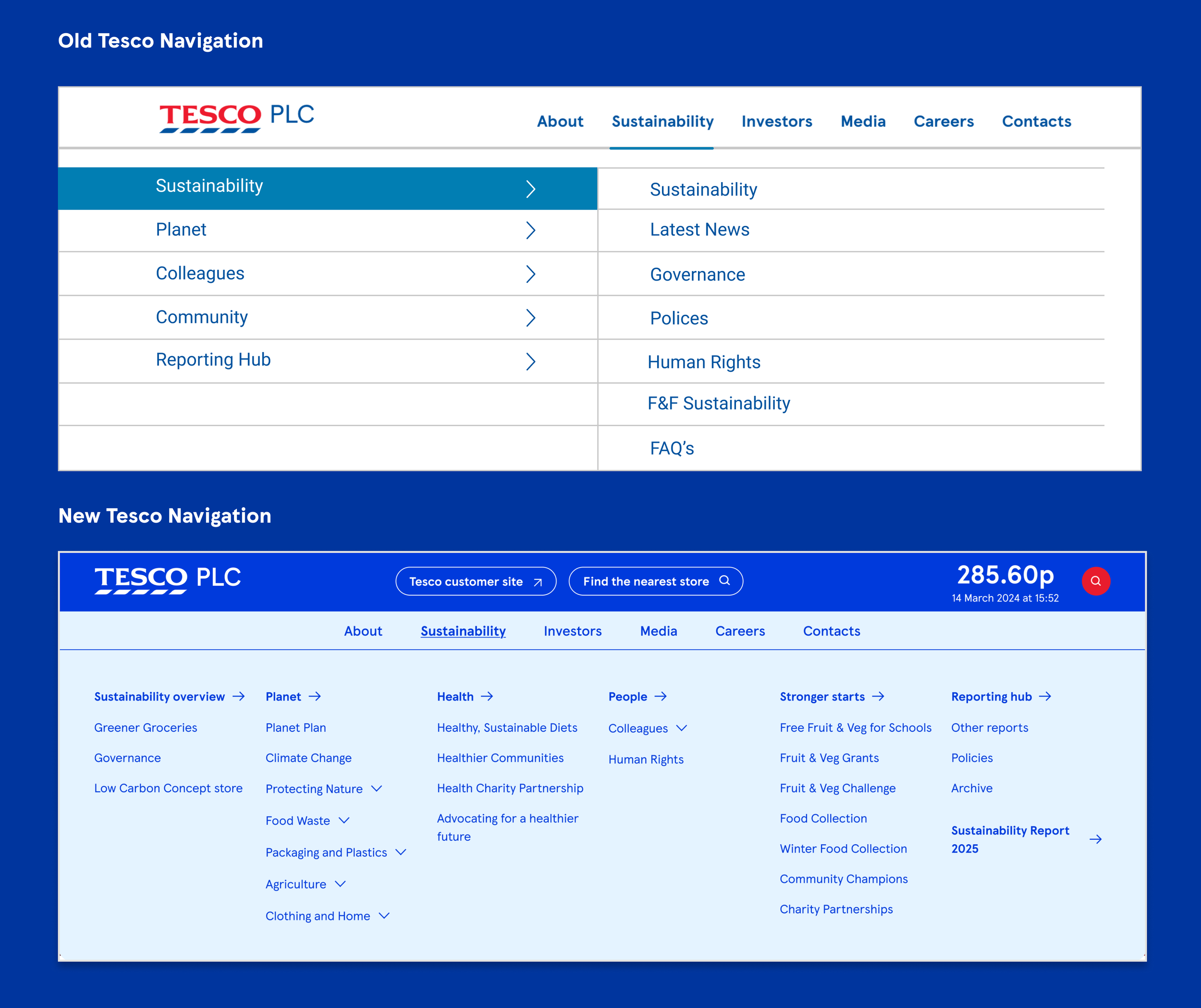
Defining the IA & Redesigning the Navigation
The new information architecture was shaped by the core needs of Tesco's main user groups: Generalists, investors (specialists), and employees. A Clear structure and visibility to important issues from those audience groups within the navigation were thought of in the design to reduce bounce rate and user fatigue, which was identified as a main problem in the previous navigation.
A well-structured navigation does more than help users find pages; it sets expectations for what the site contains, reduces the cognitive load of searching, and builds trust by showing users the full scope of content upfront rather than making them dig for it. For a site as content-dense as Tesco's, this clarity is critical to keeping users engaged.
We redesigned both the look, functionality and page numbers (from 68 pages on the sustainability sections to 40 pages) to better align with user expectations and support smoother navigation across the site.
04- Design
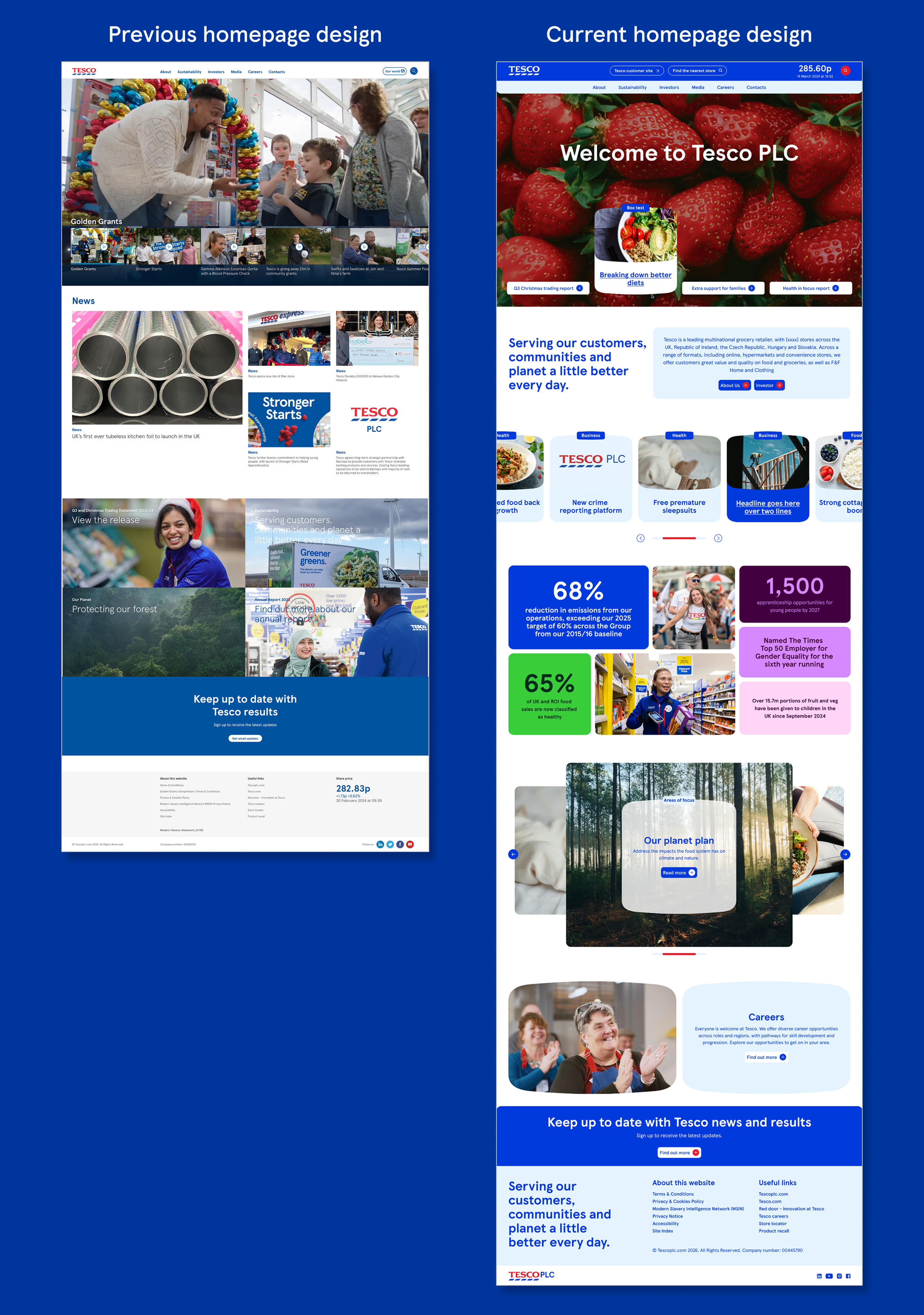
Tesco homepage redesign
The homepage is the first window into Tesco’s world, and for a global company it needs to work hard to meet all types of audiences’ expectations. The homepage has to immediately orient a wide range of users toward the information most relevant to them, without overwhelming any single group. A cluttered or unclear homepage risks losing users before they ever find what they came for, increasing bounce rates and undermining trust in the brand. As well, Tesco PLC's website encounters a lot of confusion for people looking for more of the consumer side of Tesco (the grocery store), which caused a larger-than-average bounce rate for the website.
To mitigate these issues, I designed a homepage that clarified Tesco's key messages, better reflected the scale and impact of the business, created clear pathways into the site's content and ensured there was a clear button to connect to Tesco’s consumer website for a smoother transition. All this for the audience to come away with a clear impression of who Tesco is.
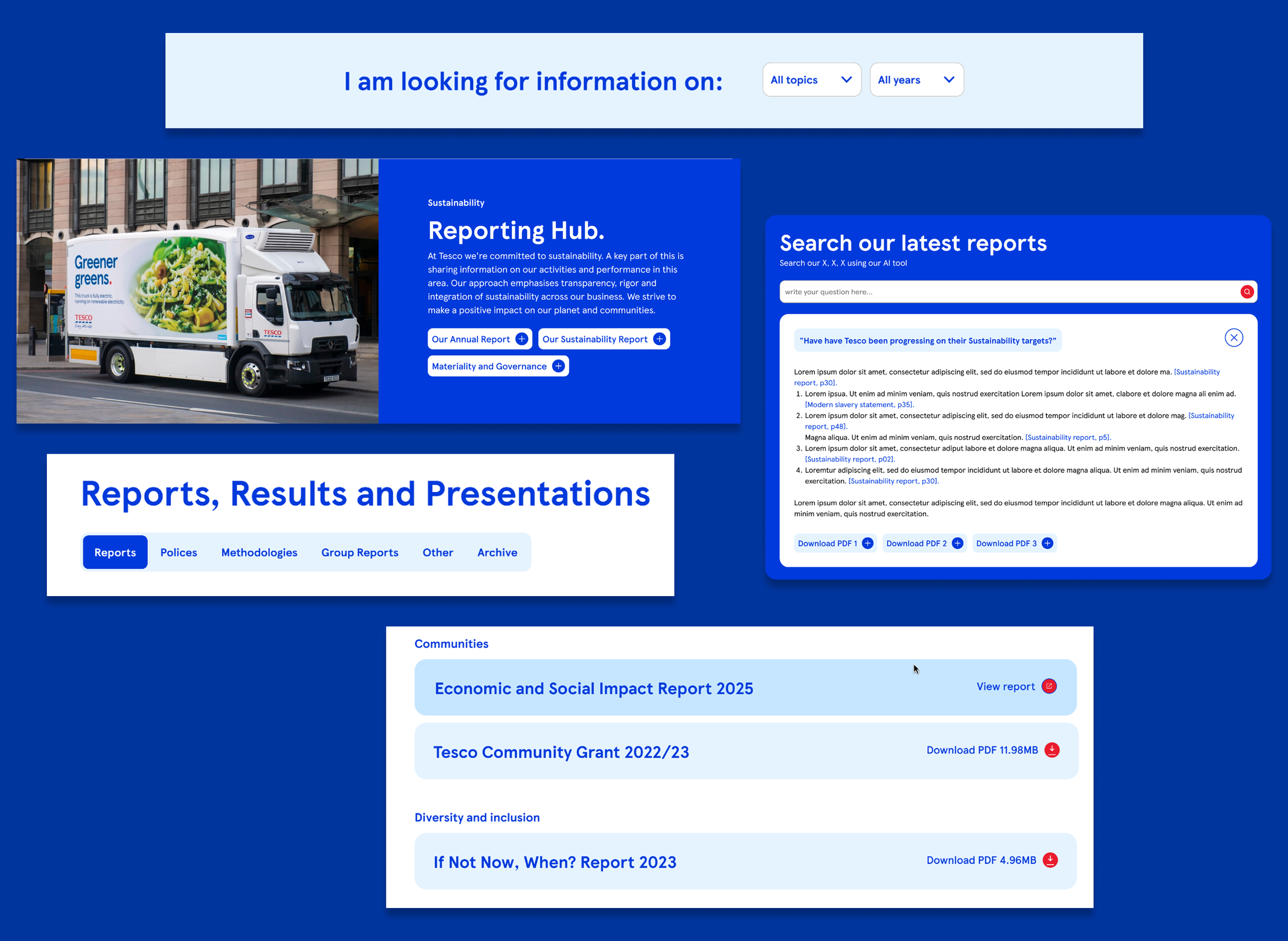
Reporting hub and AI search integration
The Tesco reporting hub was quickly identified as an important aspect of Tesco's strategy and a key interest to the 'specialist' audience group. The reporting hub needed to allow this user group to download the annual report, be updated on the latest sustainability goals and initiatives and hold key documents for any future sustainability assessments.
Adding in a key filter allowed those specialist users to be able to access key information quicker than searching based on the document type, while an AI search integration helped a more generalist audience be able to answer questions from Tesco’s own reports without having to open any documents. The faster this ‘specialist’ group was able to access information, the more engaged these groups remained on a page.
Message and strategy for sustainability progress
From our audience research, we found there was more of a generalist audience which consisted of a younger demographic that was just learning the ins and outs of Tesco's sustainability strategy. This demographic needed an engaging, simplified story to paint the picture of the wider issues Tesco's sustainability strategy would face in today’s world. From a user experience and content perspective, we chose to tell this story through an ‘outside in’ perspective. This meant that content on each page presents the larger problem before discussing how Tesco would address the issue. For the user experience and engagement, we added bold stats, quote blocks and images to help guide the user and help bring the audience into the overall experience. The content and messaging were kept simplified, with more complex governance attached to ensure that even a specialist audience's needs were met.
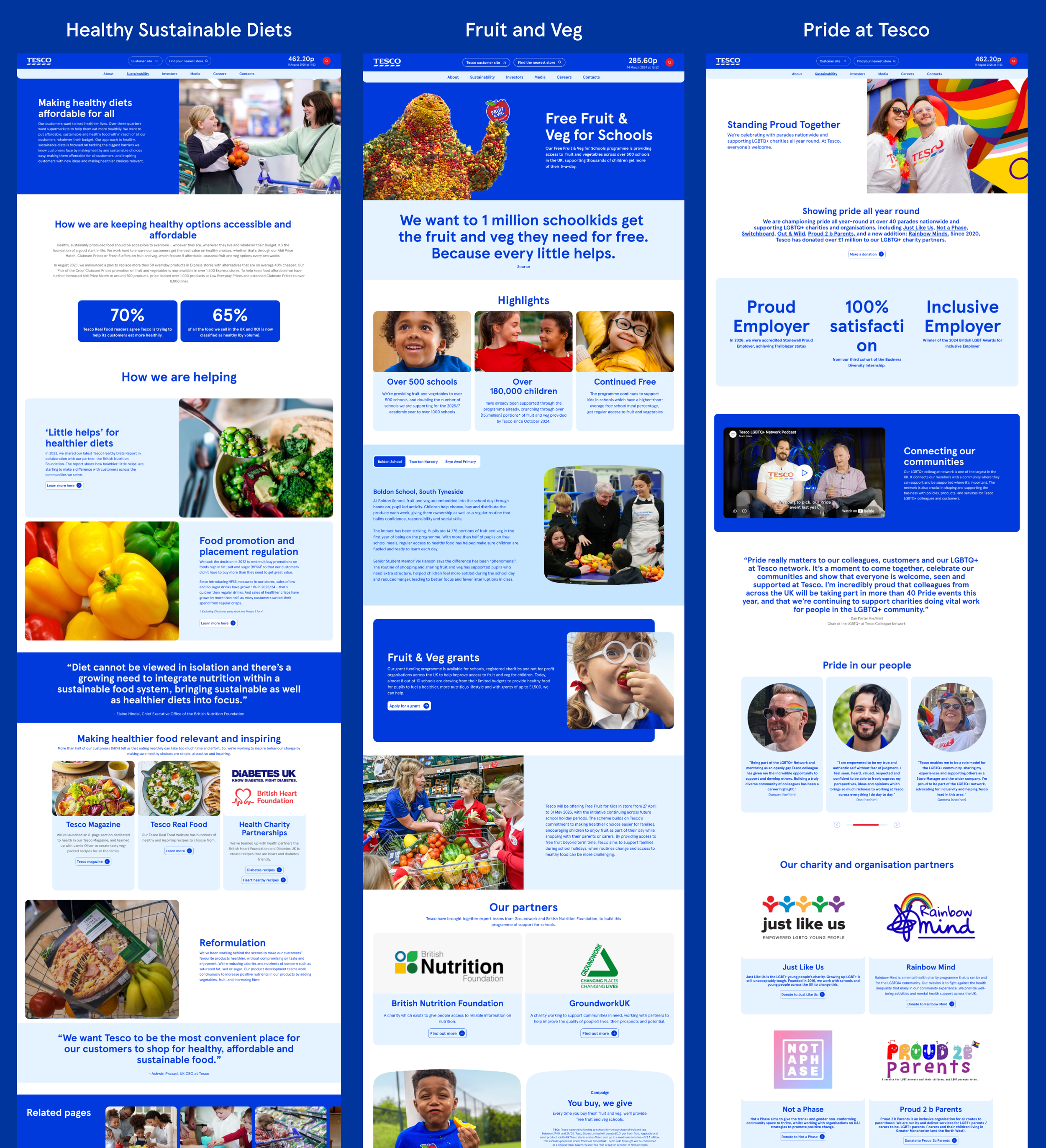
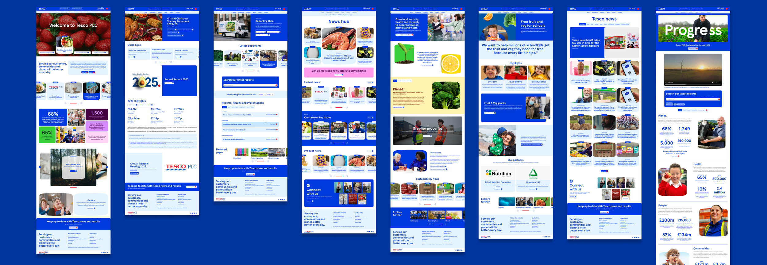
I have been Leading User experience design on the Tesco account for 5 years. My role has morphed from UX researcher to digital strategist, working across all Tesco internal teams.
Since the relaunch of Tesco PLC
- Users are more engaged than previous Tesco PLC user viewing 40% more content during a session
- 99.91% uptime across all sections of the Tesco PLC website
- 80% of users spend more time on the site since the re-launch
There was so much more work that went into this project than outlined above, so if you would like to see more, take a look at the full website here
05- Metrics
*Pages of the website may look differently than outlines. Radley Yeldar’s team is constantly improving the Tesco PLC website through ongoing contact with the Tesco team. The designs above are from the redesign and relaunch in 2025.